
Dynamic Panel Widgets
A dynamic panel is a container that holds other widgets in sets called "states." A dynamic panel can have one state or many, and only one of its states is visible at a time. The visible state can be set dynamically with the Set Panel State action, which makes dynamic panels perfect for creating carousels and slideshows.
Dynamic panels are unique in that they are the only widget type that can be dragged or swiped in the web browser. They are also the only widget type that can be pinned to a fixed position in the browser window, making them the ideal choice for always-visible navigation headers and sidebars.
Creating Dynamic Panels
Drag from the Libraries Pane
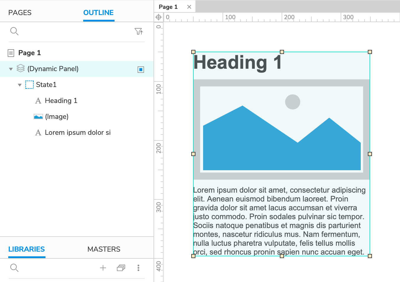
There's an empty dynamic panel widget in the Default widget library. A dynamic panel dragged onto the canvas from the Libraries pane will start out with a single, empty state you can add widgets to.
Note
This dynamic panel's dimensions are fixed by default, so make sure to enable Fit to Content on it if you want it to automatically resize to fit to its contained widgets.
Create with Existing Widgets
You can create a new dynamic panel using widgets already on the canvas. Select one or more widgets, right-click, and select Create Dynamic Panel in the context menu. This will create a new fit-to-content dynamic panel with a single state that contains the selected widgets.
The Dynamic Panel Mask
Dynamic panels are covered with a blue mask by default to make them easier to spot on the canvas. You can toggle the mask at View → Masks in the application menu.
Note
Widget masks, including the dynamic panel mask, are not applied in the web browser.
Managing States
On the Canvas
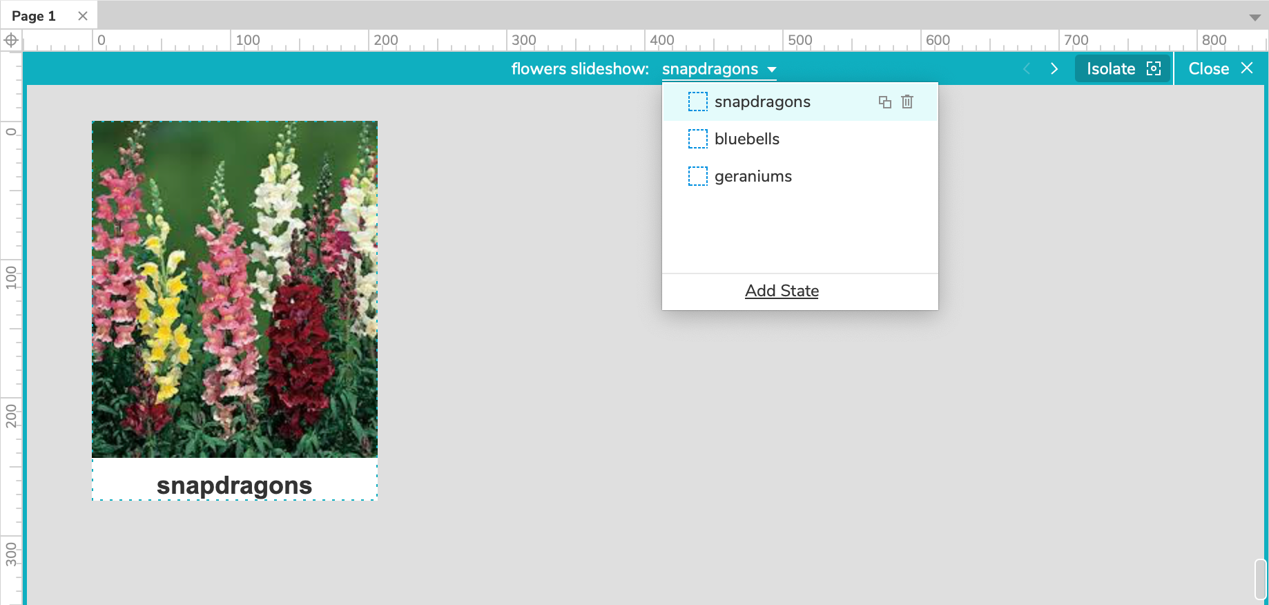
Double-click a dynamic panel on the canvas to enter state-editing mode, indicated by a teal border and toolbar surrounding the canvas.
In this mode, you can add, remove, and edit widgets in the dynamic panel's states. You can also toggle the visibility of the widgets outside the dynamic panel by clicking Isolate at the top-right of the canvas.
To edit the dynamic panel states themselves, click the current state's name at the top of the canvas. In the dropdown that appears, you can do the following:
- Click a state's name to view its widgets on the canvas
- Click the Duplicate State icon to the right of a state's name to make a copy of it
- Click the Delete State icon to the right of a state's name to delete it
- Click Add State at the bottom of the dropdown to create a new state
- Drag the state names up and down to reorder them (the topmost state is the one that's visible by default)
In the Outline Pane
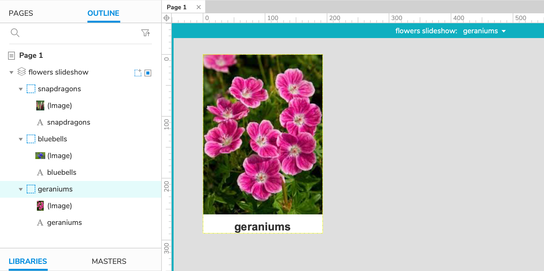
Select a dynamic panel state or one of its contained widgets in the Outline pane to open the state for editing on the canvas.
To quickly move existing widgets into or out of a dynamic panel state, drag them in the Outline pane.
To add a new state to a dynamic panel, mouse over its name and click the Add State icon to the right. Similarly, you can duplicate a state by mousing over its name and clicking the Duplicate State icon to the right. Select a state and press DELETE to delete it, or right-click and select Delete in the context menu.
To reorder a dynamic panel's states, drag them up and down or right-click them and use the options in the context menu. The topmost state is the one that's visible by default.
Tip
If a dynamic panel is getting in the way of you interacting with other widgets on the canvas, you can temporarily hide it from view by clicking the Hide from View icon to the right of its name in the Outline pane. This will hide the panel on the canvas, but it will still be visible in the web browser. To show the panel again, click the icon again.
Break Away First State
The Break Away First State option allows you to remove the first state of a dynamic panel and place all of its contained widgets on the canvas outside the panel. To access this option, right-click the dynamic panel and select Break Away First State in the context menu.
Note
If a dynamic panel has only one state, breaking the state away will also delete the panel.
Border Styles and Background Fills
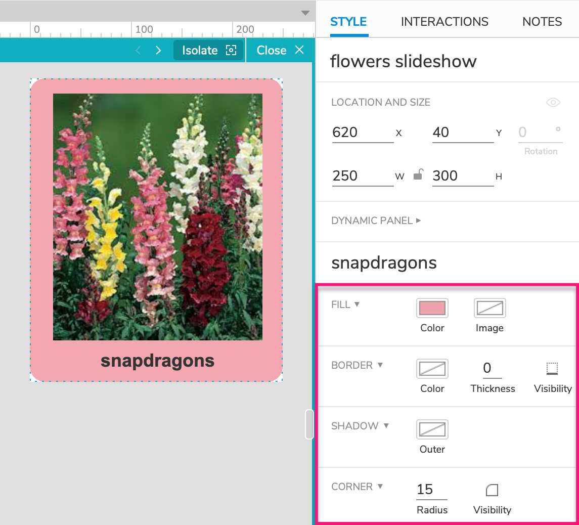
You can style your dynamic panel states with the following options in the Style pane. Each state has its own selections for each property, so you can style them all alike or differently.
Fill color or image: These are background properties, so the fill color or image will only be visible in areas of the dynamic panel not covered by widgets.
Border color, thickness, and visibility: The state's borders render in front of its contained widgets, so thick borders can overlap or cut off widgets at the edges of the panel state.
Outer shadow: The shadow renders behind the dynamic panel itself, and it should always be visible per the offset values you select in the Style pane.
Corner radius and visibility: The state's corners render in front of its contained widgets, so rounded corners can overlap or cut off widgets at the corners of the panel state.
Note
When you have the dynamic panel itself selected, changes made to these style options are applied only to the panel's first state.
Special Properties
Fit to Content
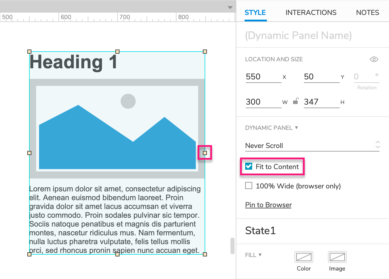
Setting a dynamic panel to "Fit to Content" allows its width and height to automatically resize to fit to its contained widgets. This resizing occurs when switching between differently sized panel states and when changes are made to the visible state’s contained widgets.
To toggle this setting, check or uncheck the box for Fit to Content in the Style pane or double-click any of the dynamic panel's resize handles.
Note
Fit to Content will be automatically disabled if you manually resize a dynamic panel, either via the W and H fields in Style pane or by dragging the panel's resize handles.
Scrolling
You can make the content of a dynamic panel scrollable by making the dynamic panel itself shorter or narrower than the content of its states. This toggles off Fit to Content and hides any widgets that fall outside the boundaries of the dynamic panel.
Then to enable scrolling, choose one of the following options in the Scroll dropdown in the Style pane:
- Scroll as Needed
- Scroll Vertical
- Scroll Horizontal
Note
Dynamic panels can be scrolled only in the web browser, and the styling of the scrollbars is controlled by the browser. Mock scrollbars will appear on the dynamic panel in Axure RP, but they are not functional.
100% Wide
A "100% wide" dynamic panel is used to make a color or image span the full width of the browser window.
Start by setting a background color or background image for the first state of a dynamic panel. Then, check 100% Wide in the Style pane. When you view the prototype in your web browser, the background color or image will extend the full width of the window. If you resize the window, the width of the dynamic panel (and its background) will be adjusted automatically.
Note
This property only resizes the dynamic panel itself. Its contained widgets are unaffected.
Pin to Browser
The "Pin to Browser" option fixes a dynamic panel in place relative to the browser window, meaning it won't move when the page is scrolled. Use this option to build things like always-visible navigation headers and modal windows.
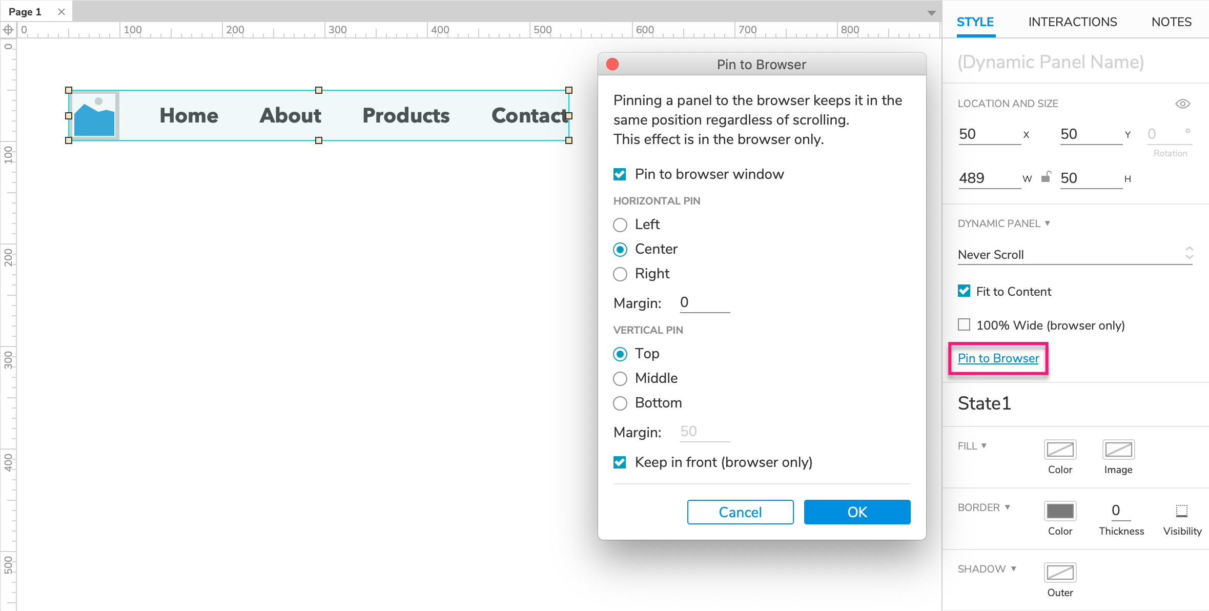
Select a dynamic panel and click Pin to Browser in the Style pane.
In the dialog that appears, check the box for Pin to browser window to enable the feature.
Below, configure the horizontal and vertical positioning of the panel.
Note
Margins for the Left and Top pin options are automatically set based on the dynamic panel's X and Y coordinates on the Axure RP canvas. To change these margins, move the Dynamic Panel on the canvas.
Check the box for Keep in front if you'd like the panel to always appear in front of all other widgets on the page.
Click OK to close the dialog.
Special Interactions
Dynamic Panel-Specific Events and Actions
Dynamic panels have some special capabilities that no other widgets have: they can be dragged, swiped, and scrolled, and a panel's active state (the one that's visible) can be changed dynamically. You can harness these capabilities via events (Dragged, Swiped Up, etc.) and actions (Set Panel State, move with drag, etc.) that are unique to dynamic panels. To learn more, take a look at the article on interaction events, cases, and actions.
The Set Panel State Action
If you have created a dynamic panel with multiple states, you can use the Set Panel State action to dynamically change the panel's visible state in the web browser.
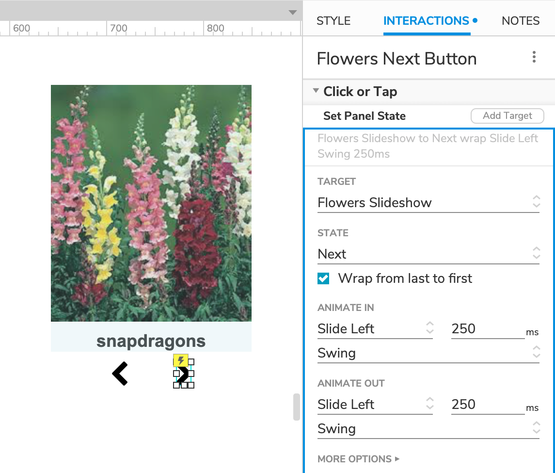
When configuring the action, you can select a state from one of these options:
A specific state's name
Next, which will set the panel to the next state in the list. This option can be used with the Repeat every...ms checkbox to automatically cycle through all of the panel's states. Adding the Wrap from last to first option will allow you to create repeating structures like image carousels and slideshows.
Previous, which will set the panel to the previous state in the list. This option can be configured similarly to Next
Stop Repeating, which will stop any further automatic Next or Previous repeating
Value, which allows you to set the panel to a particular state via its name or its position in the list of states (1, 2, 3, etc.). You can enter a literal value in this field or dynamically populate it with a variable or expression. This is handy for setting the state of a dynamic panel on another page
Fire Mouse Style Effects
By default, widgets with mouse style effects inside dynamic panels work as usual: the style effect is shown when you mouse over or click on the widget in the web browser. You can, however, choose to fire the style effects of all contained widgets at once when you mouse over or click on any part of the dynamic panel itself, including any empty space between widgets.
To do so, select the dynamic panel and check the box for Fire Mouse Style Effects in the Interactions pane.
Interactions on Dynamic Panels VS Contained Widgets
Dynamic panels have some of the same events as their contained widgets might have (Click or Tap, for example), which can potentially lead to conflicts. If a dynamic panel and one of its contained widgets have actions set up on the same event, the widget's actions will be executed instead of the panel's.
Selection Groups
You can create a relationship between a group of shape, line, image, and/or dynamic panel widgets in which only one widget at a time can be set to its selected state with the Set Selected/Checked action. (This is similar to the relationship between radio buttons in a radio group.)
To learn more, check out the Selection Groups article.