
Repeater Widgets
The repeater widget is an advanced widget type used to display repeating collections of text, images, and other elements. Repeaters are containers that hold a single set of widgets, called the "item," that is repeated several times on the page. Each repetition of the item can be different from the others, and the differences are controlled by data entered into the repeater's tabular "dataset."
Because repeaters are data-driven, they can show dynamic sorting and filtering. Reach for a repeater when you need to demonstrate a dynamically sortable or filterable design, such as a dynamic table or list of products. Repeaters can take a lot of work to set up, though, so if your prototype doesn't require true dynamic sorting and filtering, you'll want to use regular widgets instead, such as the table widget.
The repeater widget is available in the Common section of the Default widget library.
The Item and the Dataset
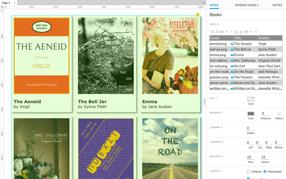
The repeater widget is made up of two parts: the "item" contains the collection of widgets that will be repeated, and the "dataset" contains the table of data that controls the appearance of each repetition.
Text and images stored in the dataset are displayed on widgets in the item via interactions under the repeater's Item Loaded event.
The Item
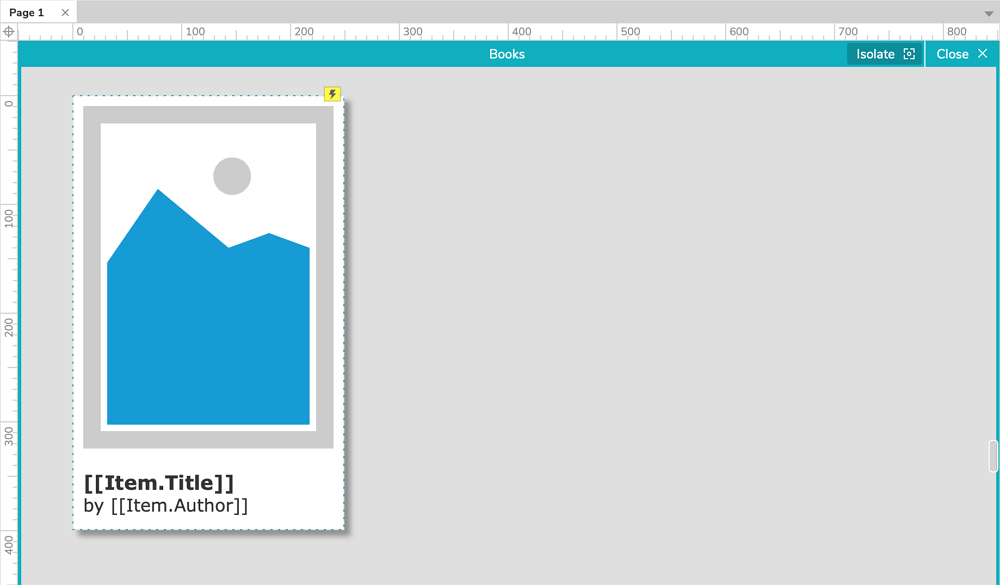
The collection of widgets that is repeated is called the "item." You can edit the widgets in the item by double-clicking the repeater on the canvas or in the Outline pane. While editing the item, you'll see only one instance of its contained widgets, and you can hide other widgets on the page by clicking Isolate at the top-right of the canvas.
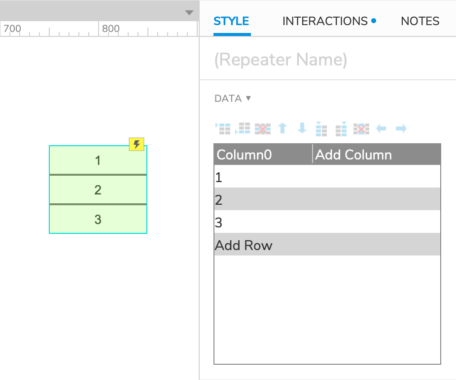
The widgets in the repeater's item are repeated once for each row of data in the repeater's dataset. For example, the repeater in the Default widget library starts with a single rectangle widget in its item and three rows of data in its dataset. This is why you see the rectangle repeated three times when you first drag the default repeater onto the canvas.
The Dataset
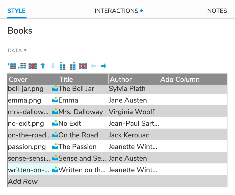
The table of data that controls a repeater's item repetitions is called the "dataset." You can view and edit a repeater's dataset in the Style pane. To add a row or column to the dataset, click Add Column, Add Row, or use the icons above the table. You can also use these buttons to move and delete columns and rows, or you can do so by right-clicking the cells in the table.
The data in a repeater's dataset are what determine the differences between the repetitions of the repeater's item. For example, the repeater in the Default widget library starts with three rows of data, each containing a number: 1, 2, and 3. These are the numbers that you see printed on the repeater's three rectangle widgets on the canvas. (This linking is accomplished with an interaction, explained in the next section.)
Tip
You can paste tabular data from spreadsheet applications like Microsoft Excel and Google Sheets into a repeater's dataset by selecting a cell and pressing CTRLV (Windows) or CMDV (Mac).
Displaying Data in the Item
Text
To enter text into a dataset cell, select the cell and start typing. Alternatively, you can double-click a cell to edit its existing text.
To display dataset text on a widget in the repeater's item, use the Set Text action in the repeater's Item Loaded event. Select text in the Set To dropdown, and then click the fx icon to the right of the Value field.
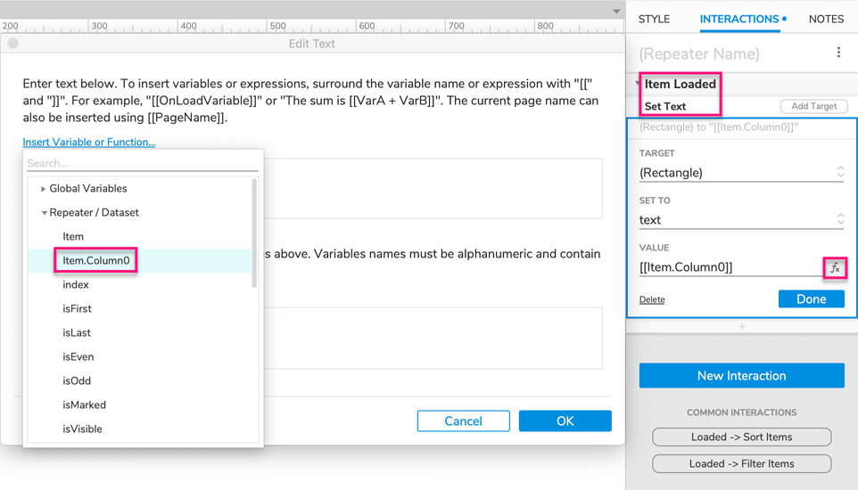
At the top of the Edit Text dialog that appears, click Insert Variable or Function. In the Repeater section of the dropdown, click Item.ColumnName, where "ColumnName" is the name of the dataset column containing your text. (If you're working with the default repeater, for example, you'll see Item.Column0 in the list.)
Click OK to close the Edit Text dialog. The text from your chosen dataset column should now be displayed on the target widget in the repeater's item.
Images
Dataset cells can also hold image files. Right-click a cell and select Import Image to bring up your computer's file browser, from which you can select your desired image.
To display dataset images on an image widget in the repeater's item, configure a Set Image action under the repeater's Item Loaded event. Under Set Default Image, select Value in the dropdown and then click the fx icon to the right of the text field.
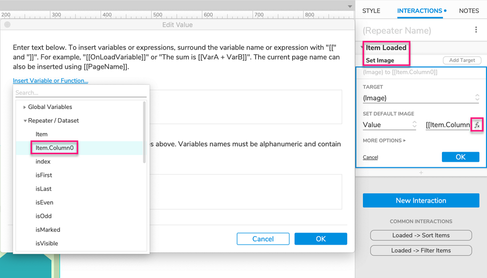
At the top of the Edit Value dialog that appears, click Insert Variable or Function. In the Repeater section of the dropdown, click Item.ColumnName, where "ColumnName" is the name of the dataset column containing your image files.
Click OK to close the Edit Value dialog. The images from your chosen dataset column should now be displayed on the target image widget in the repeater's item.
Reference Pages and URLs
Dataset cells can also hold URLs and references to other pages in the RP file. Enter URLs as plain text. To save a page reference, right-click a cell and select Reference Page. In the dialog that appears, select the page you want to store a reference for.
You can use URLs and page references to create Open Link interactions on widget events in the repeater's item — for example, a button widget's Click or Tap event. Select Link to external URL in the Link To dropdown, and then click the fx icon next to the text field with the https:// text.
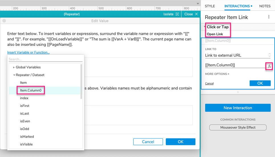
At the top of the Edit Value dialog that appears, click Insert Variable or Function. In the Repeater section of the dropdown, click Item.ColumnName, where "ColumnName" is the name of the dataset column containing the URLs and page references.
Click OK to close the Edit Value dialog. When you preview the prototype in the web browser, you should now be able to navigate to the URLs and prototype pages referenced in the repeater's dataset via the interaction you just created.
Special Properties
Spacing, Layout, and Pagination
By default, all of a repeater's items are visible, and they're laid out vertically in a single column with no blank space between items. You can change this with the options in the Spacing, Layout, and Pagination, sections of the Style pane.
Spacing
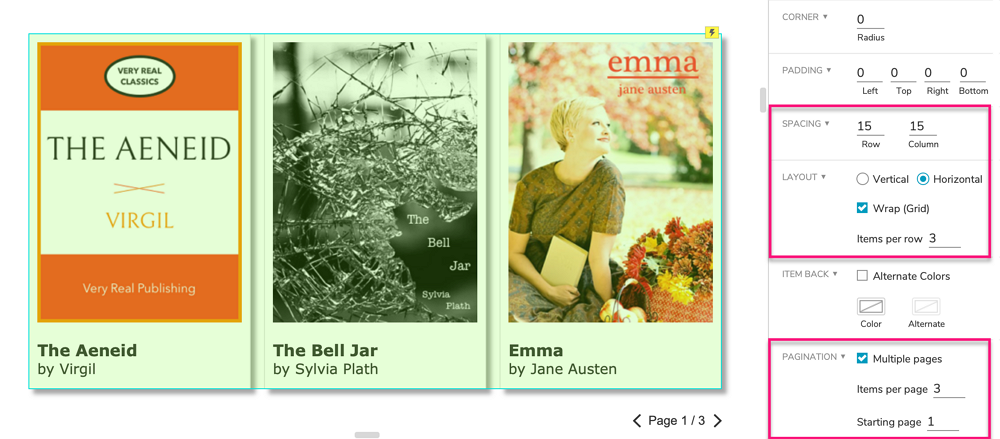
In the Spacing section of the Style pane, you can specify how much empty space there should be between the rows and/or columns of repeater items. If you've set a background color for the repeater, it will be visible in this empty space.
Layout
In the Layout section, you can choose whether the repeater's items should be stacked vertically in a column or horizontally in a row. If you would like your repeater to break into multiple columns or rows, check the Wrap (Grid) checkbox and enter the number of items you want each column or row to have.
Pagination
Paginating a repeater breaks its items up into multiple "pages" — not to be confused with the prototype pages in the Pages pane — so that you can control how many items are visible at a time.
In the Pagination section of the Style pane, check the box for Multiple pages. Enter the number of items you want to appear on each page, and enter the number of the page you want the repeater to start on (defaults to 1). You can navigate the repeater's pages using the Set Current Page action, and you can dynamically change the number of items per page using the Set Items per Page action.
To learn more, take a look at the Repeater Pagination tutorial.
Borders, Backgrounds, and Padding
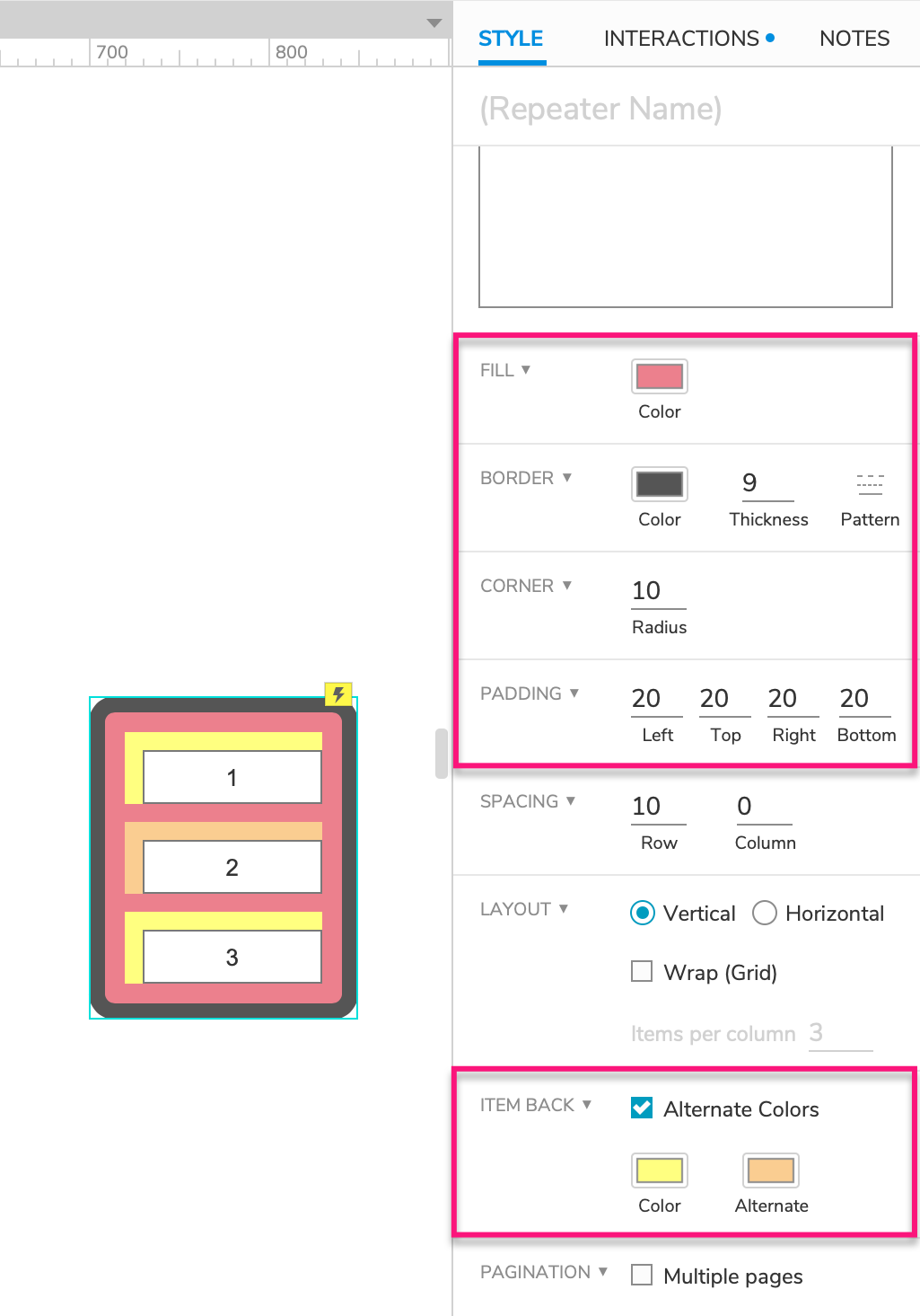
You can add borders and a background color to repeaters using the Fill, Border, and Corner options in the Style pane. Repeater borders and backgrounds render behind the widgets in the repeater's items, so you may need to add padding to the repeater in order to see them. The options in the Padding section of the Style pane allow you to create blank space between the repeater's outer edges and its items.
Repeater items can also have their own background color that's different from the background of the repeater itself. You can select this color in the Item Back section of the Style pane. Additionally, you can check the box for Alternate Colors to select a second color that will be applied to every other item. This option is handy when building tables with the repeater widget.
Fit to Content in HTML
The Fit to Content in HTML checkbox is located just above the dataset in the Style pane and is enabled by default. With this option enabled, each repeater item will automatically resize to fit to its contained widgets.
If you disable this option, each repeater item will remain at a fixed size, regardless of any changes to the size, position, or visibility of its contained widgets. Widgets moved or shown dynamically might overlap other repeater items if they extend outside the fixed boundaries of their own item.
Note
Fit to Content in HTML does not work with repeaters whose items are reloaded after the initial page load. This includes repeaters that are sorted or filtered as well as those whose rows are dynamically added, deleted, or updated in the web browser.
Isolate Radio Groups and Selection Groups
By default, radio groups and selection groups in the repeater item are evaluated separately for each instance of the item. For example, if the item has a radio group with three radio buttons in it, selecting one of the buttons will unselect the other two buttons in that instance of the item, but the other radio buttons in the other instances of the item will not be affected.
You can change this behavior by unchecking the boxes for Isolate Radio Groups and Isolate Selection Groups, located in the lower section of the Interactions pane. When these options are toggled off, radio groups and selection groups in the repeater item are evaluated across every instance of the item. Going back to our previous example, this would mean that selecting a radio button in the radio group in one instance of the item would unselect all other buttons in that radio group in every other instance of the item.
The Repeater Mask
Repeaters are covered with a green mask by default to make their contained widgets easier to differentiate from others on the canvas. You can toggle the mask at View → Masks in the application menu.
Note
Widget masks, including the repeater mask, are not applied in the web browser.
Special Interactions
Repeater-Specific Events
Item Loaded
The Item Loaded event fires once for each instance of the repeater item that gets loaded in the web browser. For example, the event would fire three times for a repeater whose dataset contains three rows since each row creates a new instance of the item. Furthermore, the Item Loaded event always handles dataset rows in order from top to bottom.
A repeater loads all its items when the page first loads, and it reloads all its items whenever changes are made to the repeater's dataset. This means that the Item Loaded event fires once for every instance of the item at page load and every time dataset rows are added, deleted, or updated.
Item Resized
The Item Resized event fires whenever an instance of the repeater item is resized due to changes to its contained widgets. This only happens when the repeater is set to Fit to Content.
Sorting and Filtering Rows
Sorting
Using the Add Sort and Remove Sort actions, you can dynamically sort a repeater's rows by any of its dataset columns. You can sort the column's values as any of the following data types:
- Number
- Text
- Text (Case Sensitive)
- Date – YYYY-MM-DD
- Date – MM/DD/YYYY
You can also choose to sort the rows in ascending or descending order, or you can toggle between the two whenever the sort is reapplied.
To learn more, check out the Sorting Repeater Rows tutorial.
Filtering
Using the Add Filter and Remove Filter actions, you can dynamically filter a repeater to only display rows that meet certain criteria. You define these criteria with boolean expressions that compare one value, usually a dataset column or other repeater item property, to another. Some simple examples include the following:
[[Item.State == 'CA']]would display only rows with the value "CA" in the State column[[Item.Price <= 20]]would display only rows whose value in the Price column is less than or equal to 20[[Item.TasksCompleted != Item.TasksAssigned]]would only display rows whose value in the TasksCompleted column does not equal their value in the TasksAssigned column
To learn more, check out the Filtering Repeater Rows tutorial.
Editing the Dataset Dynamically
You can dynamically change a repeater's dataset in the web browser using the following actions:
- Add Rows lets you add new rows to the dataset
- Delete Rows deletes rows from the dataset
- Update Rows lets you change the column values for existing rows in the dataset
- Mark Rows lets you designate rows to be deleted or updated at a later time
- Unmark Rows unmarks previously marked rows
You can learn more about working with these actions in the Adding, Deleting, and Updating Repeater Rows tutorial.
Dataset Objects and Properties
In addition to the contents of each row in the repeater's dataset, you can also access meta information about the dataset in value expressions by using the objects and properties below.
Item and TargetItem
The Item object refers to the individual repeater dataset row being handled by a given interaction, usually an action under the Item Loaded event. (This is the object you've seen used to access column values in previous sections of this document.)
TargetItem is a similar object that gives you access to all the same properties as Item. The difference between the two is that you can use TargetItem in an interaction on a widget inside the repeater's item to access information about other items in the repeater.
You can use the following properties with the Item and TargetItem objects:
Item.ColumnName: Represents the data stored in the named column. (This is the property you've seen used in previous sections of this document.)
Item.isFirst: Returns
trueif the row is the first visible row in the repeater, after all sorting, filtering, and pagination have been applied. Otherwise, it returnsfalse.Item.isLast: Returns
trueif the row is the last visible row in the repeater, after all sorting, filtering, and pagination has been applied. Otherwise, it returnstrue.Item.index: Numeric value that represents the row number in the dataset. For example, this value for the third row in the dataset would be
3.Item.isEven: Returns
trueif Item.index is an even number. Otherwise, it returnsfalse.Item.isOdd: Returns
trueif Item.index is an odd number. Otherwise, it returnsfalse.Item.isMarked: Returns
trueif the row is currently marked. Otherwise, it returnsfalse.Item.isVisible: Returns
trueif the row is currently visible in the repeater, after all filtering and pagination have been applied. Otherwise, it returnsfalse.
Repeater
The Repeater object provides information about a repeater's entire dataset. When working with a widget event inside the repeater's item, you'll access this object with Item.Repeater: [[Item.Repeater.dataCount]]
You can also use that notation when working with the repeater's own events, or you can use This as a shortcut since the repeater is accessing its own properties: [[This.dataCount]]
When working with a widget or page event that exists outside the repeater, you'll need to store the repeater as a local variable and then append the properties below to the local variable name: [[LVAR1.dataCount]]
You can use the following properties with the Repeater object:
Repeater.dataCount: Numeric value that represents the total number of rows in the repeater's dataset.
Repeater.itemCount: Numeric value that represents the number of rows in the repeater after all filtering has been applied.
Repeater.visibleItemCount: Numeric value that represents the current number of visible rows in the repeater, after all filtering and pagination has been applied.
Repeater.pageCount: Numeric value that represents the total number of pages in the repeater.
Repeater.pageIndex: Numeric value that represents the number of the currently visible page in the repeater.