
Styling Pages
Style Properties
You can edit the following properties to customize the style of your prototype's pages. You can access these properties in the Style pane.
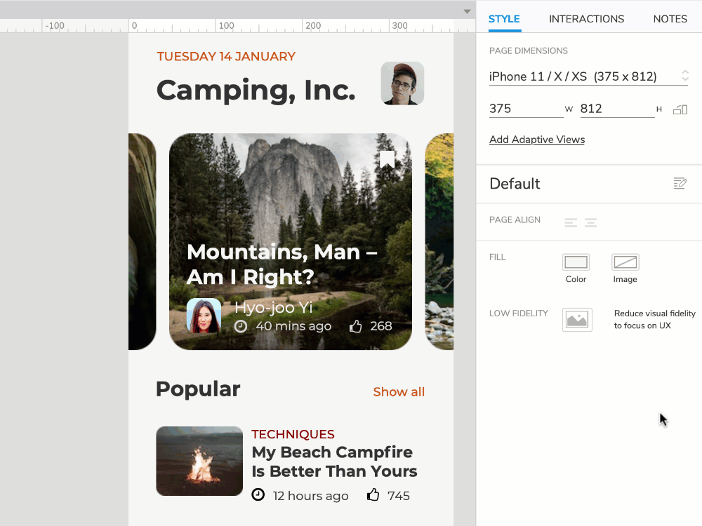
Page Dimensions
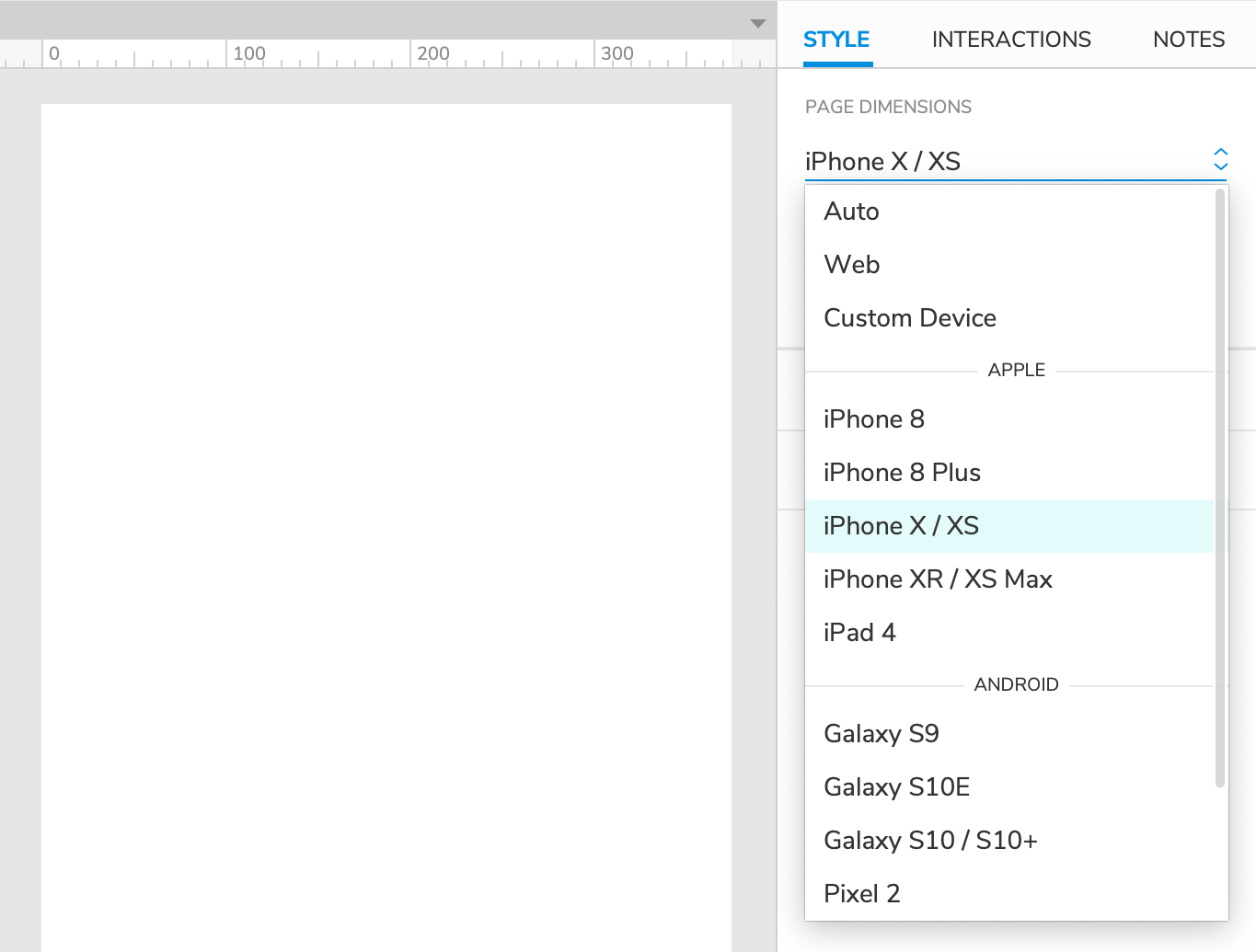
By default, page dimensions are automatically calculated based on the widgets on the canvas, and the canvas itself is not constrained. If desired, you can set a static width and/or height for your page using the Page Dimensions dropdown. Select from a number of popular device dimensions or define your own custom dimensions with the Web and Custom Device options.
When you select dimensions for a page, the canvas changes size to match, with grey negative space framing a white viewport region. This framing is reflected in the web browser as well.
Tip
When viewing a prototype on a mobile device, select Scale to Width in the prototype player's view settings to make the page content fit to the device's viewport.
To clear static dimensions from a page, set the Page Dimensions droplist back to Auto.
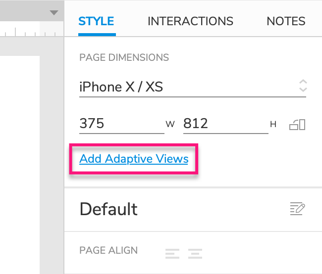
Adaptive Views
If you're designing for multiple viewport sizes, click Add Adaptive Views to set up a separate set of page dimensions for each target viewport. You can resize and reposition your content for each viewport size, and the web browser will automatically display the appropriate view for the target device's viewport.
Check out the Adaptive Views article to learn more.
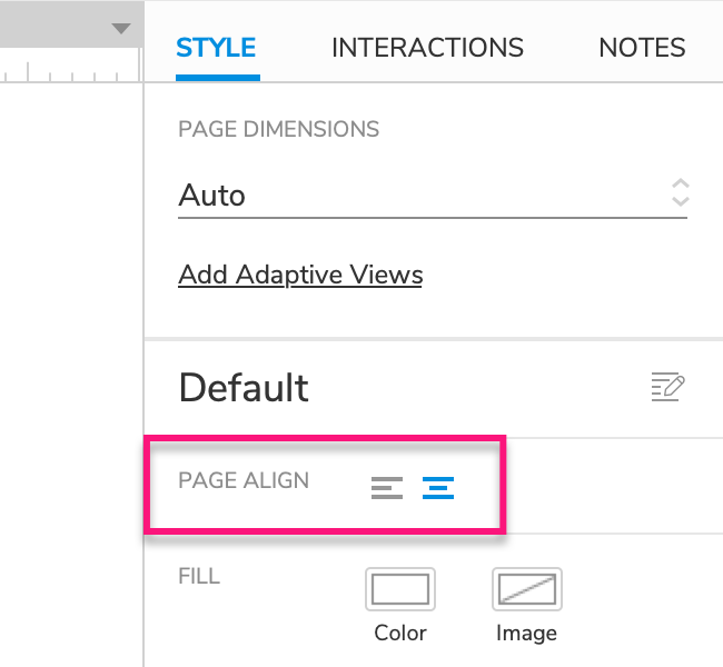
Page Alignment
Choose between Align Left and Align Center to determine whether the page's content is aligned to the left edge of the browser window or the center.
Note
Page alignment does not affect the alignment of widgets on the Axure RP canvas.
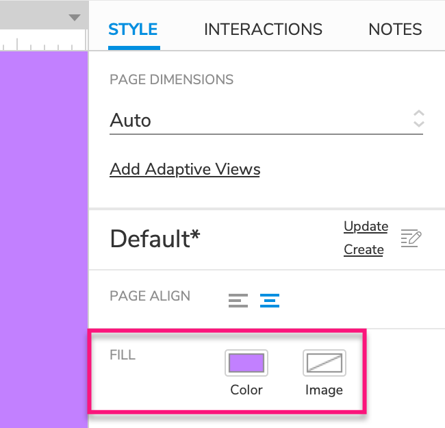
Fill
Color: Sets a page's background color and opacity.
Image: Sets a page's fill image and the image's alignment and cover type.
Note
Color and image fills are applied both in Axure RP and in the web browser.
Low Fidelity Mode
Low Fidelity mode reduces the visual fidelity of your pages to help your stakeholders focus on the UX of a design rather than its visuals.
While Low Fidelity mode is active on a page, it is converted to greyscale, and all fonts are replaced with the Axure Handwriting font for a rougher look.
Page Styles
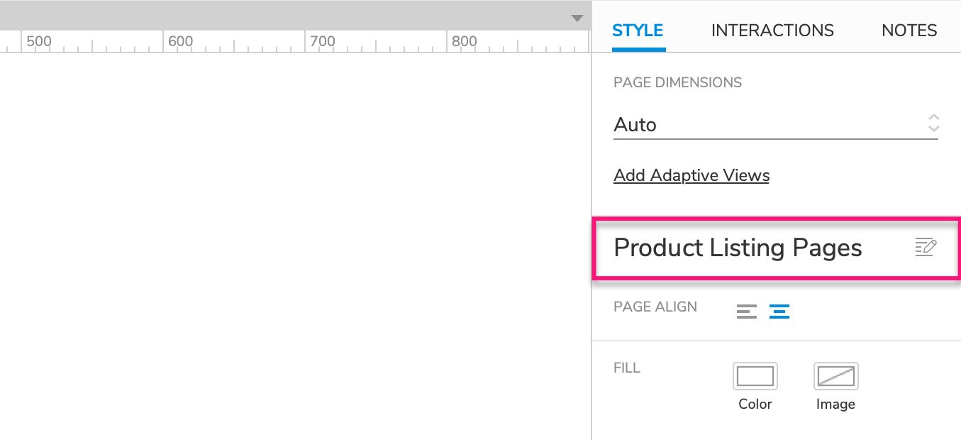
Page styles are reusable, centrally managed sets of style properties. You can apply a single page style to multiple pages in order to unify their styling. If you change one of the property selections in the page style, the change will be applied to all pages using that style.
To apply a page style to a page, click the canvas and then select the page style in the page style dropdown in the Style pane.
You can view and manage the page styles in a prototype by clicking the Manage Page Styles icon next to the page style dropdown in the Style pane.
Page Style Hierarchy
Every page's visual appearance is determined by style property selections made in the following locations, in order from lowest to highest priority:
The Default style at the top of the Page Style Manager dialog, whose style property selections are applied to every page in the prototype.
Tip
All pages start out in the Default style. If you need to quickly make a style change to all pages in your prototype, and you're not yet using any other page styles, update the Default style.
The page's applied page style, whose style property selections override the selections in the Default style.
Style property selections made on the page itself in the Style pane, which override the selections in both the Default style and the page's own applied page style.
Note
When a page's style property selections differ from those of its applied page style, the style's name is followed by an asterisk in the Style pane.

Updating and Creating Styles
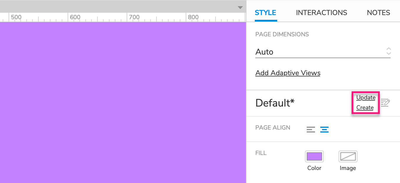
Quick Update
To quickly update a style, edit the styling of a page currently using the style. Then in the Style pane, click Update to the right of the style name to update it. The update will apply to all pages in the project currently using that style. It will also apply to any future pages using that page style.
Quick Create
To quickly create a new style, edit the styling of any page. Then in the Style pane, click Create to the right of the page's currently applied page style. The Page Style Manager dialog will open with the page's styling changes already added to a new style. In the left column of the dialog, rename the new page style. In the right column, you can optionally make additional changes to the style.
The Page Style Manager
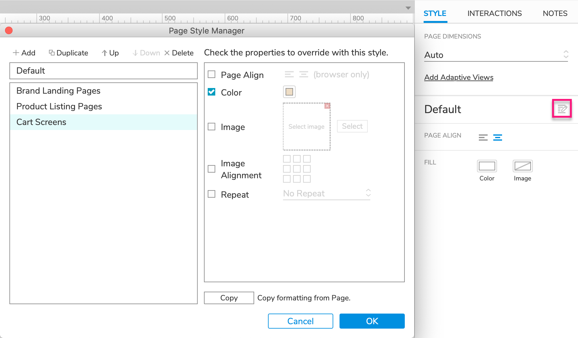
Click the Manage Page Styles icon, next to the page style dropdown in the Style pane, to open the Page Style Manager.
To add a new style, click Add at the top of the dialog. Alternatively, you can click Duplicate to make a new style from an existing style.
To delete a style, select it and click Delete. Use the Up and Down arrows to reorganize the styles in the dialog.
To edit the style properties of a page style, select it in the left column. In the right column, check the box next to a style property to have that property override the Default style, and then make your selection for the property in the applicable field.
You can also edit multiple styles at once. Hold CTRL or CMD while selecting styles in the left column and then make changes in the right column.
Styles in Team Projects
Styles in a team project can be edited without checking out the project styles. To update style changes for all users of the project, send changes via the Team → Send Changes to Team Directory menu command.