Text Field and Text Area Widgets
Text fields and text areas are form controls that users can type responses into in the web browser. They are located in the Forms section of the Default widget library.
Use a text field widget when prototyping a form field for which a short (single-line) response is expected, such as a username or password field. (These are also good for search fields.)
Use a text area widget when prototyping a form field for which a long (multi-line) response is expected, such as a feedback form.
Tip
You can capture the text that users enter into text fields and text areas and pass that text to other pages in the prototype. Learn how in the Pass Text to Next Page tutorial.
Hint Text

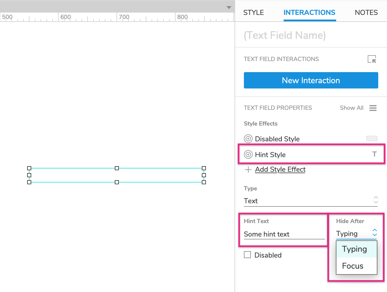
You can add hint text (also called "placeholder text") to a text field/area using the Hint Text field in the Interactions pane. Hint text will appear in a text field/area until the user interacts with it, at which time it will disappear to allow the user to fill in the input as needed.
You can choose whether the hint text will be hidden after the text field/area has been focused or after the user starts typing. Use the Hide After dropdown to make your selection.
Hint text is grey by default and appears in the font applied to the text field/area. To change the hint text's styling, edit the Hint style effect in the Interactions pane.
Input Types (Text Fields Only)
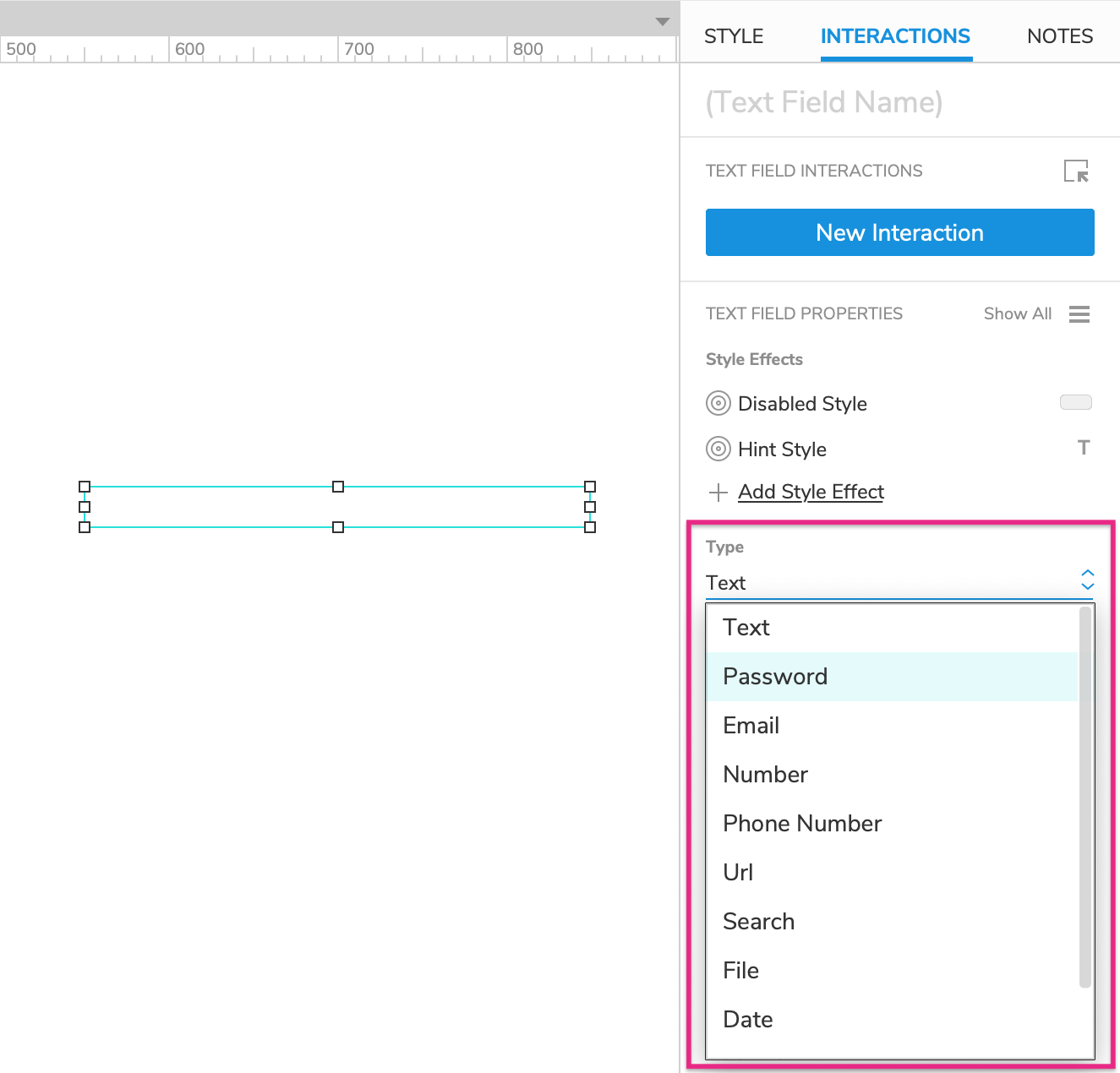
You can give text field widgets different input types to denote their function in a user input form. Use the Type dropdown in the Interactions pane to select the input type for a text field.
Keep in mind that web browsers often apply their own styling to certain types of text fields. In addition, when you select a text field on a mobile device, some field types will cause a different type of keyboard to appear, such as a number keypad instead of the alphanumeric keyboard.

Note
Text field types are a feature of HTML, not an invention of Axure's — we're just giving you access to them. As such, you'll find that certain field types are more applicable to working in Axure RP than others.
The different types of fields and the results of using that field type are as follows:
Text: Default setting used for basic text entry
Password: Text is masked as it is entered
Email: May prompt an email keyboard on mobile devices
Number: Only accepts numeric input, may prompt a numeric keyboard on mobile devices
Phone Number: May prompt a dial pad on mobile devices
URL: May prompt a URL-entry keyboard on mobile devices
Search: May add a search button to keyboard on mobile devices. Some web browsers may add an "X" icon you can click to clear the field
File: Changes the text field into a file-upload button in the web browser, which will open the device’s file browser when clicked (though it is not possible to upload a file to an Axure RP prototype)
Date: May prompt a browser-styled date picker or calendar control
Month: May prompt a browser-styled month and year picker
Time: May prompt a browser-styled time picker
Tab Order
Tab order for text fields, text areas, and other form widgets is determined by their layer depth, as shown in the Outline pane. You can learn more about this and how to change a widget's tab order in the Organizing Widgets article.
Special Properties
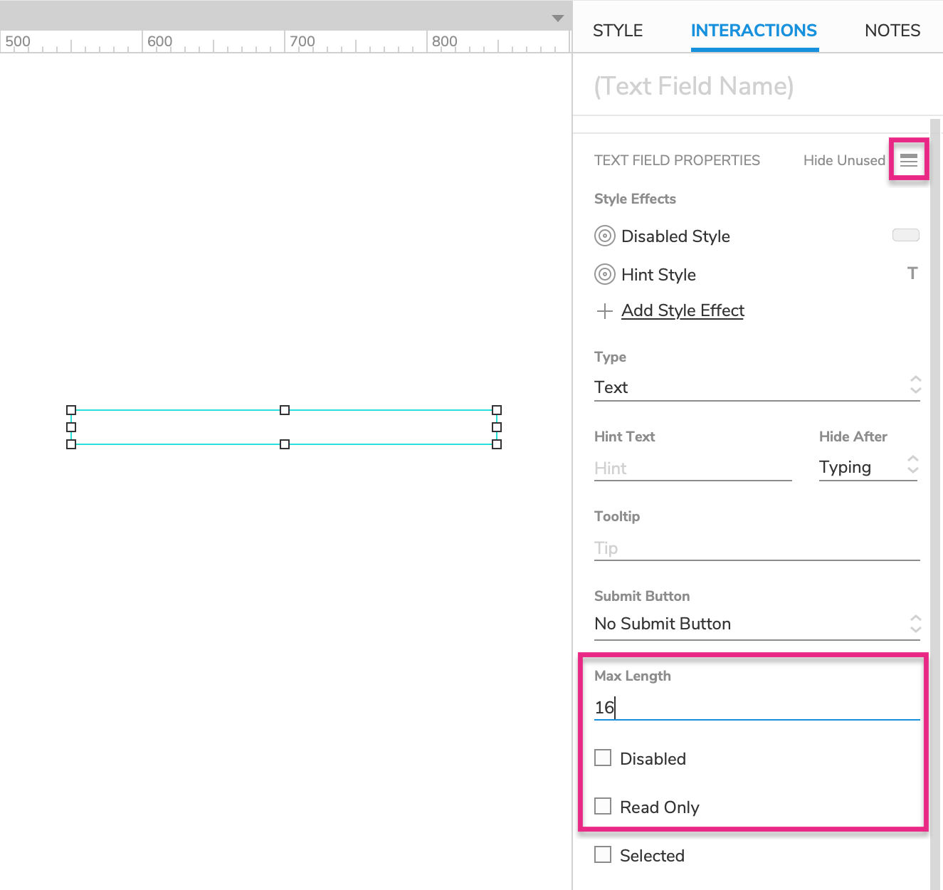
You can access some additional properties of text field and text area widgets by clicking Show All in the Interactions pane.

Maximum Length (Text Fields Only)
You can use the Max Length field in the Interactions pane to specify the maximum length of entry a text field will accept. The field will stop accepting additional text input once the maximum character length has been reached.
Disabled
Disabling a text field or text area prevents users from interacting with it in the web browser. This also activates the widget's Disabled style effect, making it appear greyed-out.
There are two ways to disable a widget:
Check the Disabled checkbox at the bottom of the Interactions pane.
Disable the widget dynamically in the web browser with the Enable/Disable action. You can do this as part of any interaction, such as when the page loads or when a button is clicked.
Tip
You can dynamically enable a disabled widget in the web browser with the Enable/Disable action. Check out the Terms and Conditions tutorial for an example of how this can be done.
Read Only
When you set a text field/area to "read only," the text already on the widget can be seen and selected in the web browser, but it can't be changed by the user. To set a text field/area to read only, check the Read Only checkbox in the Interactions pane.
Special Interactions
Capturing and Evaluating the Entered Text
You can access the text entered in a text field or text area via the text on widget value option in actions and conditions. For example, you can set the value of a global variable to the text on a text field/area in order to carry that text over to a different page.
You can also evaluate a text field or text area's text in a condition to only execute a certain case if the text matches a particular value, as you might do when verifying a username and password combination.
Submit Button
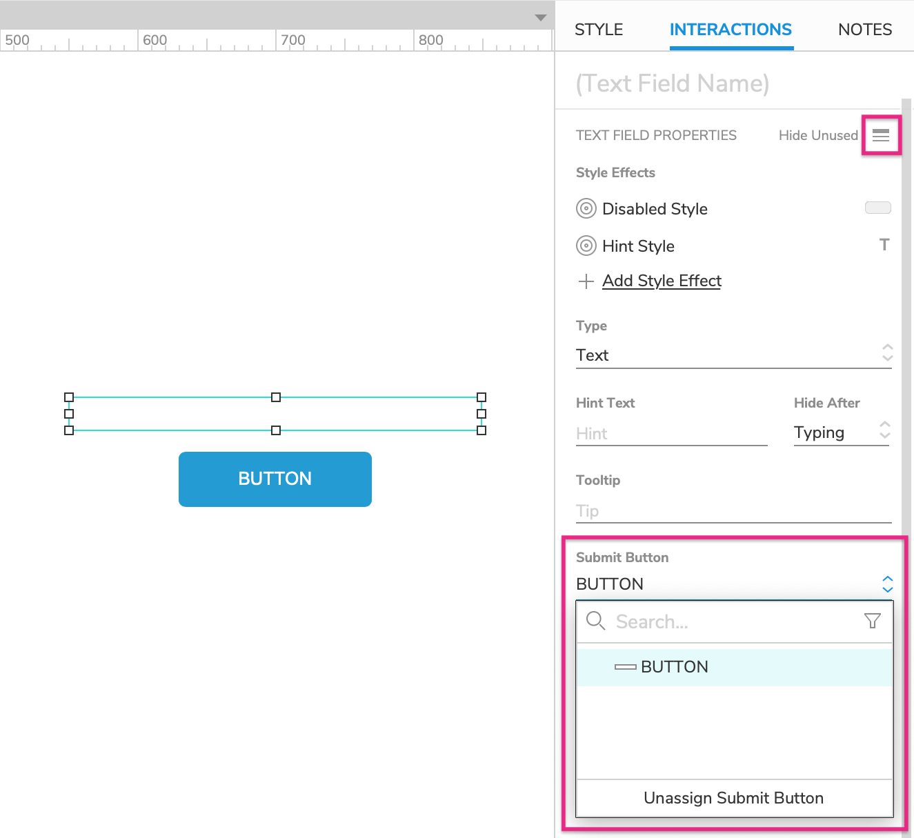
Pressing the ENTER key while a text field or text area has focus in the web browser can fire the Click or Tap event of another widget on the page, known as the text field/area's "submit button."
To assign a submit button to a text field/area:
Select the text field/area and click Show All in the lower section of the Interactions pane.
Choose from a list of eligible widgets in the Submit Button dropdown.
To unassign the submit button, click Unassign Submit Button at the bottom of the dropdown.

