Text Links
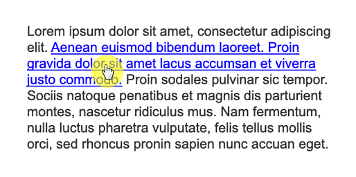
Text links are a unique widget type that cannot exist on their own. Rather, they must be added to and exist as a part of the text on a shape widget.

Creating and Deleting Text Links

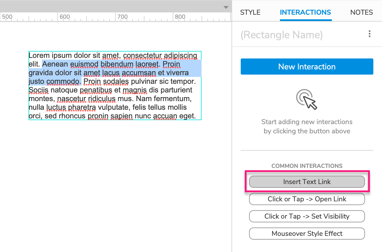
To create a text link, edit the text on a shape widget by double-clicking it or selecting it and pressing ENTER. Then, select the portion of the text you want to turn into a link and click Insert Text Link in the Interactions pane.
To delete a text link, select it on the canvas and press DELETE.
The Text Link Mask
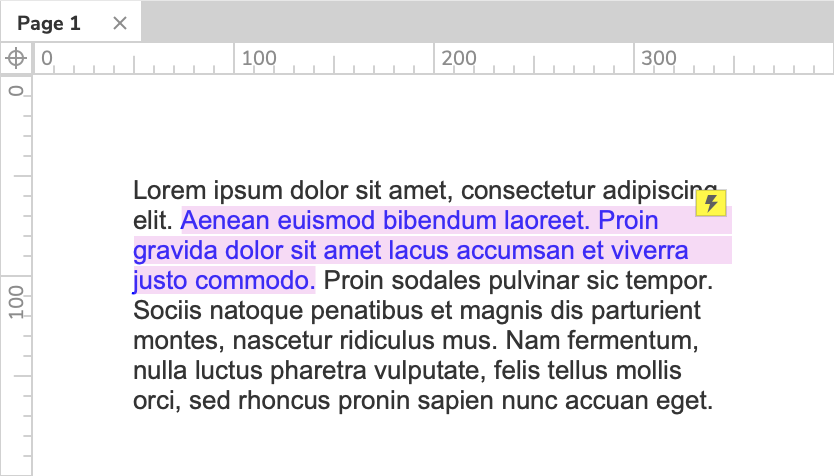
Text links are covered with a pink mask by default to make them easier to spot on the canvas. You can toggle the mask at View → Masks in the application menu.
Note
Widget masks, including the text link mask, are not applied in the web browser.

Styling Text Links
You can change the styling of a text link independently of the rest of the text on its parent widget. Select the text link and make your style selections in the Style pane or the style toolbar.
To change the styling for all the text links in your project, update the Text Link widget style, which is applied to all text links by default.
Style Effects
Text links have the MouseOver and MouseDown style effects enabled by default. To change the styling applied by these effects, update the Text Link Mouse Over and Text Link Mouse Down widget styles.
Text Link Interactions
Though the default interaction for text links is to navigate to a new page when the link is clicked, you can customize text link interactions in the Interactions pane just like those of any other widget type.
The following events are available for text links:
- Click or Tap
- Mouse Enter
- Mouse Exit
- Got Focus
- Lost Focus
Tip
Some common text link interactions include Click or Tap → Scroll to Widget and Mouse Enter → Show Widget.
