Widget Libraries
Widgets in Axure RP are organized into libraries, which you can access in the Libraries pane. Axure RP comes with four widget libraries pre-installed — Default, Flow, Icons, and Sample UI Patterns — but you can also install additional libraries and even create your own.
Tip
There are many different custom widget libraries available for free download or for purchase from the Axure user community. You can browse through them in the Community section of our website at www.axure.com/support/download-widget-libraries.
Axure RP widget libraries are stored in your computer's file system as standalone .rplib files.
Switching Between Libraries
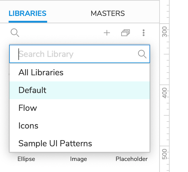
The dropdown menu at the top of the Libraries pane lists all widget libraries and local image folders current loaded into Axure RP as well as any libraries available to you via Axure Cloud.
To switch to a widget library, click the dropdown and select the library in the list. Alternatively, you can select All Libraries to view the contents of all your loaded libraries at once.
Adding and Removing Libraries
Adding Local Library Files
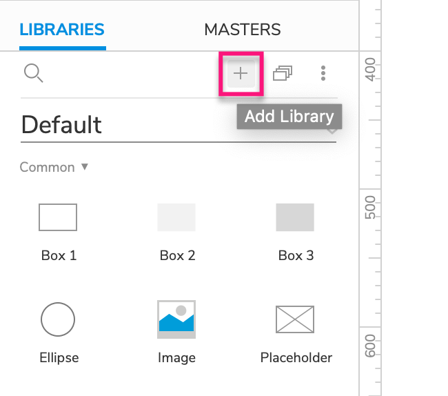
To add a locally stored widget library file to the Libraries pane for use, click the Add Library icon at the top of the pane. In the file browser that appears, locate your desired .rplib file and select it to add it to the pane.
Every time you open Axure RP, it will attempt to load all of the local libraries you've added in the past. Axure RP will also attempt to load any libraries it finds at the following file locations:
Windows: C:\Users\%USERNAME%\My Documents\Axure\Libraries
Mac: ~/Documents/Axure/Libraries
Tip
To see where a local library file is stored, click the Options menu at the top-right of the pane and select Find on Disk.
Adding Libraries from Axure Cloud
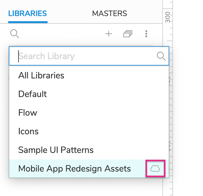
Widget libraries can be hosted on Axure Cloud just like regular prototype files, and you can add Axure Cloud–hosted libraries to Axure RP directly from the Axure Cloud servers. Cloud-hosted libraries appear in the list with a cloud icon beside them.
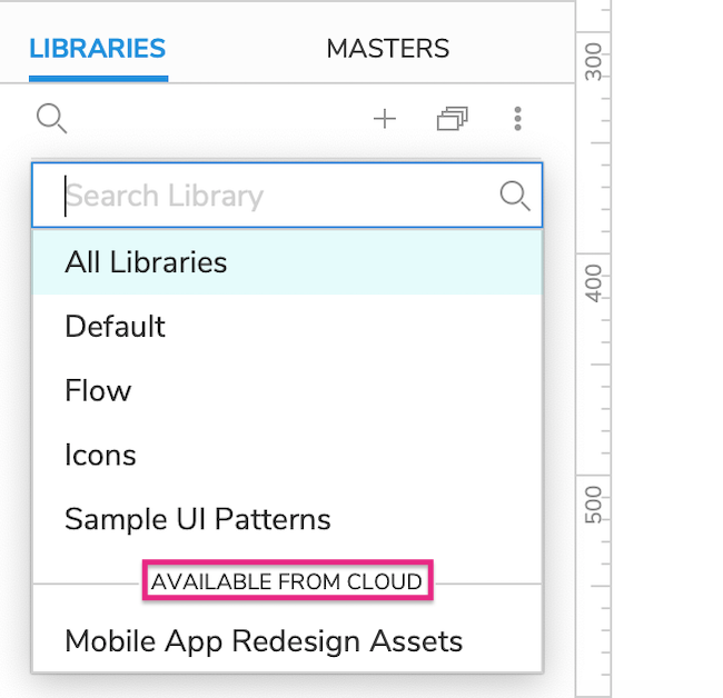
Click the dropdown menu at the top of the Libraries pane. Under the Available from Cloud heading toward the bottom of the list, you'll see all the Axure Cloud–hosted widget libraries you currently have access to. Click one of those libraries to download and use it.
Every time you open Axure RP, it will attempt to load any Axure Cloud libraries you've previously added. It will also automatically attempt to download any changes to the libraries since you last used them.
Removing Libraries
To remove a library from Axure RP, select it in the dropdown at the top of the Libraries pane. Then, click the Options menu at the top-right of the pane and select Remove Library.
Creating Libraries
You can create a widget library for your own use or to share with your team or the Axure community. You can work alone or collaborate with team members to create a library as a Team Project.
Go to File → New Library to create a new widget library. To turn your new library into a team project, follow the instructions in the Creating and Sharing Team Projects article.
Creating Custom Widgets
When you're working in a widget library, the Pages pane is replaced by the Widgets pane, which includes the same options. Each widget you add to this pane will appear as a widget in the Libraries pane when you add your custom library to Axure RP for use.
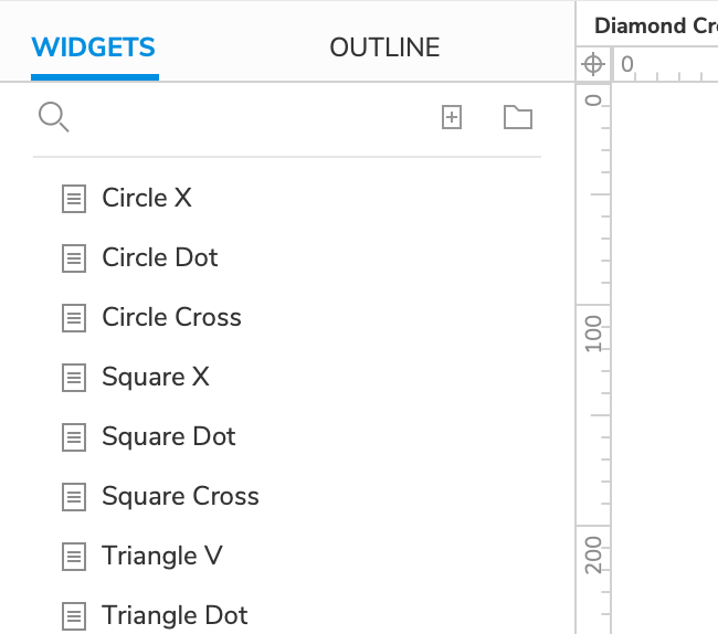
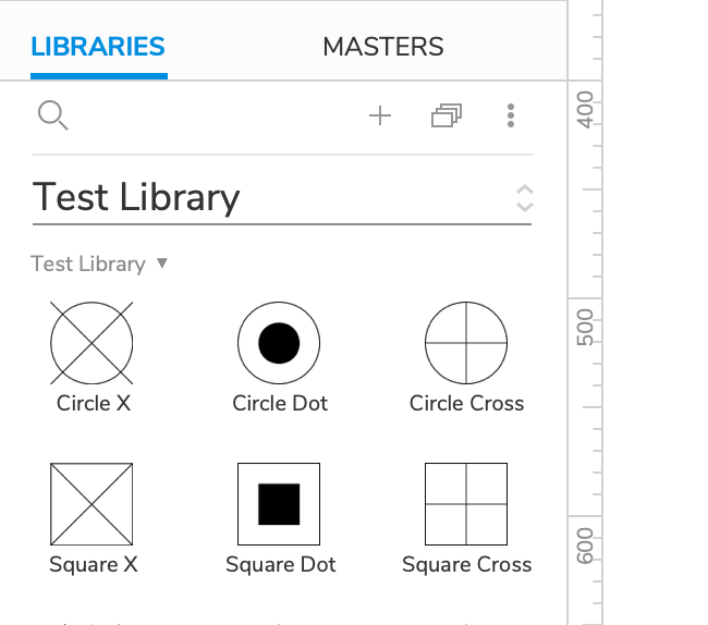
The workflow for building custom widgets is largely the same as it is for building pages in a regular prototype file: double-click a widget in the Widgets pane to open it on the canvas, and then add component widgets to the canvas from the Libraries pane.
Tip
If your custom widget is made up of multiple component widgets, it can be helpful to group them so they can act as a single widget when added to a diagram in a regular prototype file.
Organizing Widgets into Folders
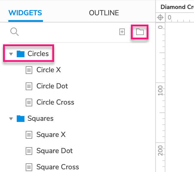
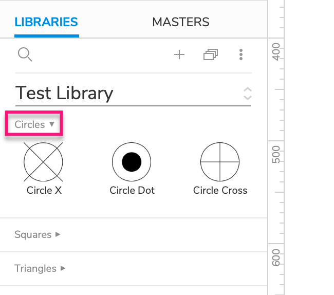
Widget libraries can include collapsible section headings, such as Forms and Markup in the Default library. To create these in your custom libraries, add your widgets to folders with the Add Folder icon at the top-right of the Widgets pane.
Widget Styles
Just like in a regular prototype file, you can use widget styles to centrally manage widget styling in your custom widget libraries. When you add one of your custom widgets to the canvas in a prototype file, its widget style is automatically added to the prototype's list of widget styles.
Interactions
You can build interactivity into the widgets in your custom library, allowing you to create reusable interactive assets like buttons, switches, flyouts, and more.
Icons in the Libraries Pane
Every widget is represented by an icon in the Libraries pane. By default, a custom widget's icon is a small thumbnail image of its content. If desired, you can replace this thumbnail with a custom icon.
To add a custom icon to a widget, open the widget for editing and click a blank spot on the canvas. In the Style pane, select the Custom icon radio button and use the fields below to import your custom icon images.
The base icon must be 28x28 pixels, and you can optionally add a second, 56x56 pixel image to be used on high-density displays.
![]()
Tooltips
Widget icons in the Libraries pane can include tooltips. When you mouse over the icon, a grey ? icon appears at its top-right corner, and clicking the icon shows the tooltip.
To add or edit a widget's tooltip text, open the widget on the canvas and use the Tooltip field in the Style pane.
Adaptive Views
You can set up adaptive views in your custom widget library to create adaptive widgets. To learn how to set up and work with adaptive views, check out the Adaptive Views reference article.
