Selection Groups
You can create a relationship between a group of shape, line, image, and/or dynamic panel widgets in which only one widget at a time can be set to its selected state with the Set Selected/Checked action. When a widget in the group is set to its selected state, all others are automatically deselected. (This is similar to the relationship between radio buttons in a radio group.)
Selection groups are handy for prototyping things like tab controls and accordion menus.
Creating Selection Groups

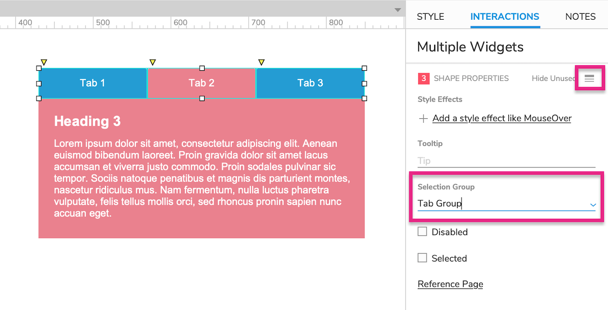
Select one or more widgets on the canvas or in the Outline pane.
Click Show All at the top-right of the Interactions pane.
Enter a name for the new selection group in the Selection Group field.
You can add more shapes to the selection group by selecting them and choosing the selection group name in the Selection Group dropdown.
To remove a shape from the selection group, select it and clear the Selection Group field's selection.
Note
Removing all widgets from a selection group will delete the group.
Setting a Widget to Its Selected State

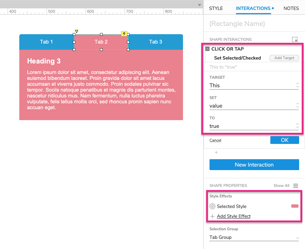
Adding widgets to a selection group is just the first step. To make use of the selection group, you'll need to create interactions that set the widgets to their selected states using the Set Selected/Checked action. A common example would be clicking a widget to select it, using the widget's Click or Tap event.
You can then change the widgets' style properties with the Selected style effect, which makes a widget look different when it's in the selected state.
You can also set up other interactions to occur when a widget enters or exits its selected state. For this, use the Selected, Unselected, and Selected or Unselected events.
