Accordion Menu Tutorial
In this tutorial, you'll learn how to make a structure in which clicking a heading expands a content area beneath it.
Note
Click here to download the completed RP file for this tutorial.
1. Widget Setup
Create the First Accordion Item's Heading
Open a new RP file and double-click Page 1 in the Pages pane to open it on the canvas.
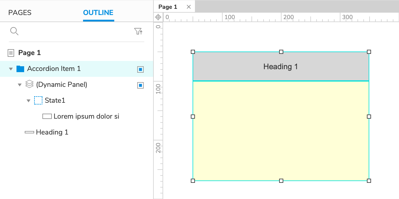
Drag a Box 3 widget onto the canvas from the Libraries pane.
Set the box's height to
50with the H field in the Style pane or the style toolbar.Set the box's text to
Heading 1.
Create the First Accordion Item's Content
Drag a Box 2 widget onto the canvas and place it directly below the Heading 1 box.
Right-click the box and select Fill with Lorem Ipsum in the context menu to fill the box with text.
Right-click the box again and select Create Dynamic Panel.
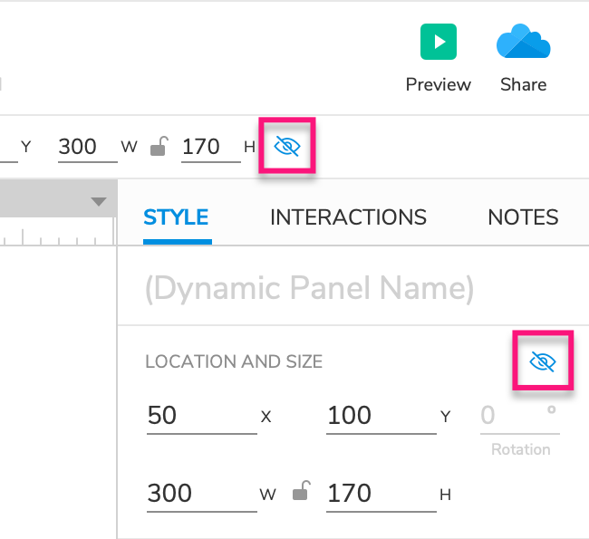
- Hide the new dynamic panel by selecting it and clicking the Hidden icon in the Style pane or the style toolbar.
Group the Heading and Content Widgets
Select the Heading 1 box and the dynamic panel and click Group at the top of the interface to place them in a widget group.
Name the group
Accordion Item 1.
2. Toggle the Content's Visibility When the Heading Is Clicked
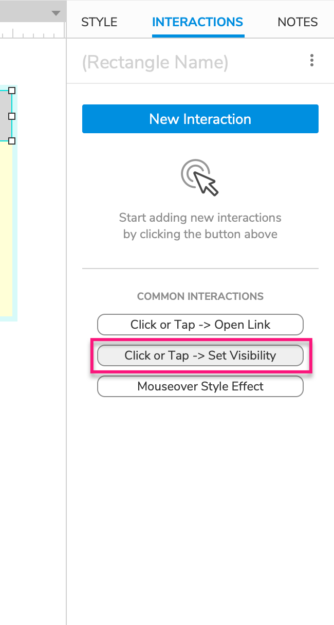
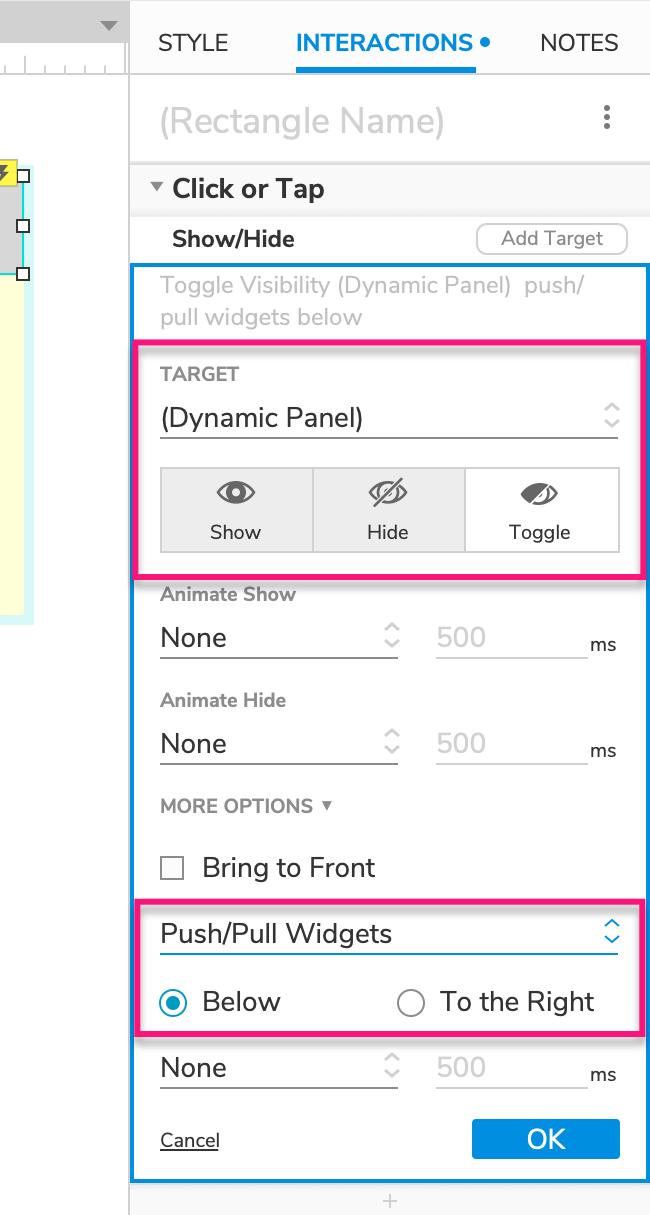
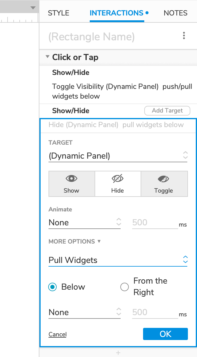
Select the Heading 1 box and click Click or Tap → Set Visibility in the Interactions pane.
Select the dynamic panel in the Target dropdown, and then select Toggle just beneath it.
Click More Options at the bottom of the action settings and select Push/Pull Widgets in the dropdown that appears.
Leave the Below radio button selected and click OK to save the action.
3. Duplicate the Group to Create More Accordion Items
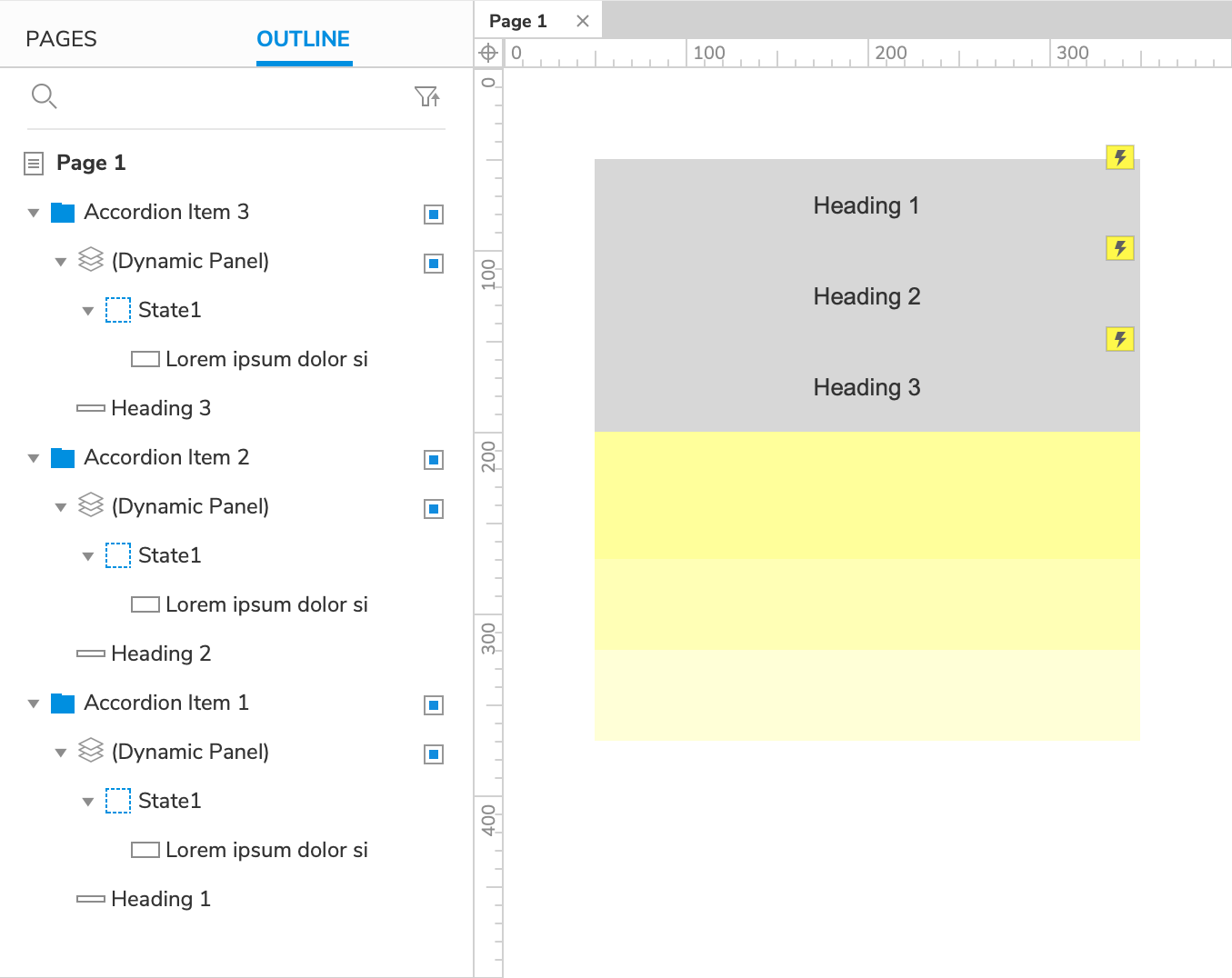
Create a Second Item
Right-click the Accordion Item 1 widget group and select Copy. Then, right-click an empty spot on the canvas and select Paste.
Rename the new widget group
Accordion Item 2and set the text on its heading box toHeading 2.Position the Accordion Item 2 group so that the Heading 2 box is just below the Heading 1 box.
Create a Third Item
- Repeat these steps to create a third widget group. Name the group
Accordion Item 3and set its heading box's text toHeading 3. Place it below the Heading 2 box.
4. Preview the Interaction
Preview the page and click the accordion headings to expand and collapse their corresponding content dynamic panels.
Additional Information and Tips
Collapse Open Items When a New Item Is Expanded
If you'd like only one accordion item to be expanded at a time, add another Show/Hide action to each heading box's Click or Tap event that hides every content dynamic panel other than its own. For example, the Heading 1 box would hide the dynamic panels in the Accordion Item 2 and Accordion Item 3 groups.
Note
Don't forget to select the Pull Widgets option when hiding the dynamic panels!