
Toggle Switch Tutorial
In this tutorial, you'll learn how to create a toggle switch that changes color when toggled on and off.
Note
Click here to download the completed RP file for this tutorial.
1. Widget Setup
Create the Toggle Switch's "Off" State
Open a new RP file and open Page 1 on the canvas.
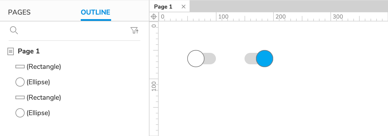
Drag a Box 3 widget onto the canvas. Set its width to
50and its height to20. In the Style pane, set its corner radius to25.Next, drag an ellipse widget onto the canvas and set both its width and height to
30.Drag the ellipse on top of the rectangle and line it up left and middle using the Align options in the top toolbar. This pair of widgets will be the toggle switch's "off" state.
Create the Toggle Switch's "On" State
Select the widgets, copy them, and paste a duplicate of them onto the canvas.
Set the duplicate ellipse's fill color to blue and align it to the rectangle widget's right edge. This pair of widgets will be the toggle switch's "on" state.
2. Place the Toggle Widgets in a Two-State Dynamic Panel
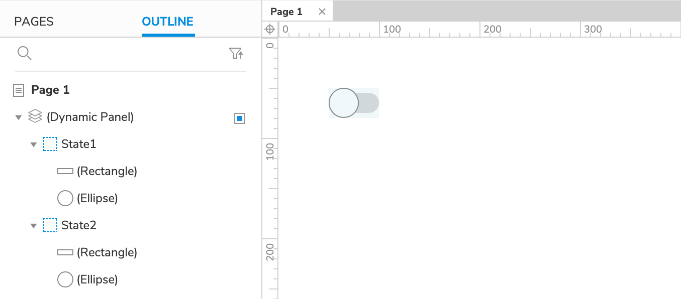
Select the "off" widget pair, right-click the selection, and choose Create Dynamic Panel in the context menu.
In the Outline pane, hover your cursor over the new dynamic panel widget's item and click the Add State icon to the right.
Still in the Outline pane, select the "on" ellipse and rectangle and drag them to the right to indent them under State 2. This will add them to that dynamic panel state and open the state on the canvas.
Move the "on" ellipse and rectangle to (0,0) on the canvas.
Click Close at the top-right of the canvas or press ESC to exit state-editing mode.
3. Set the Dynamic Panel's State to "Next" When It's Clicked
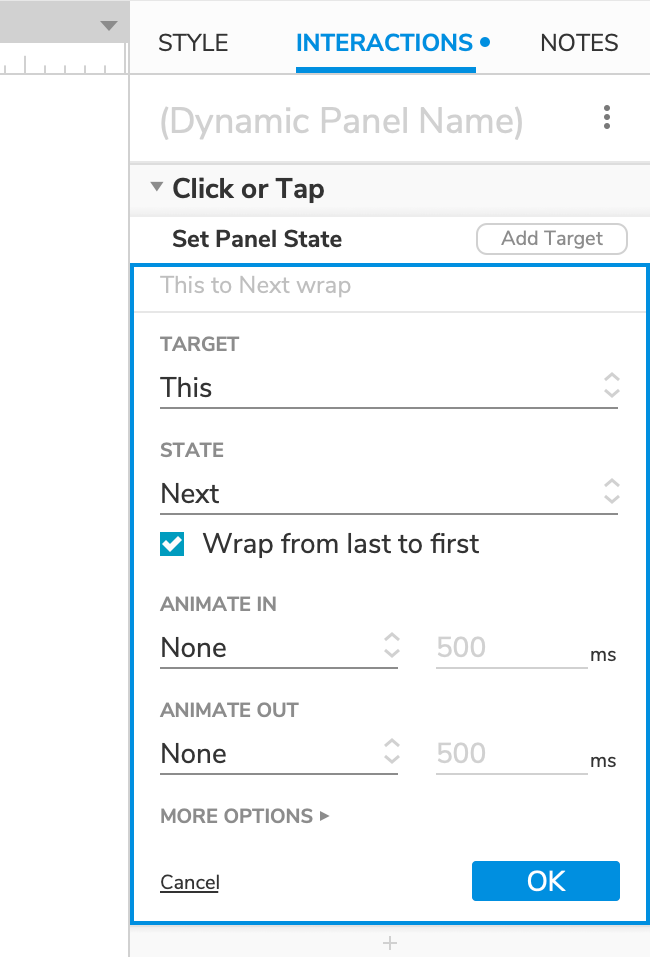
Select the dynamic panel state widget and click New Interaction in the Interactions pane.
Select the Click or Tap event in the list that appears, and then select the Set Panel State action.
Select This Widget in the Target dropdown.
In the State dropdown, select Next. Then check the box for Wrap from last to first that appears. This will allow the dynamic panel to go back to its first state after the last has been reached.
Click OK to save the action.
4. Preview the Interaction
Preview the page and click the toggle switch to toggle it on and off.