Interactive Button Tutorial
In this tutorial, you'll learn how to use style effects to create a button that takes on different styling when it's in various interactive states, such as being moused over or clicked on.
Note
Click here to download the completed RP file for this tutorial.
1. Widget Setup
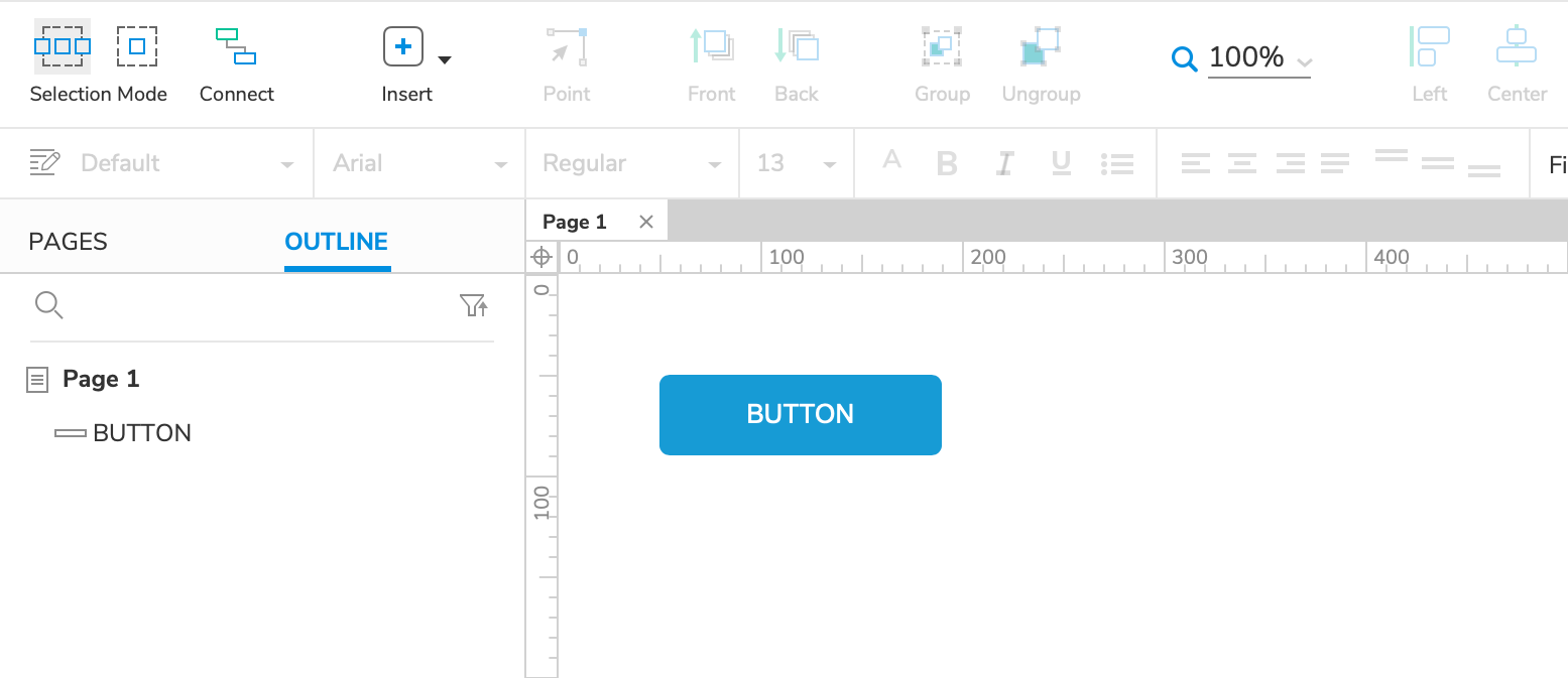
Open a new RP file and open Page 1 on the canvas.
Drag a button widget onto the canvas.
2. The MouseOver Style Effect
The MouseOver style effect temporarily changes a widget's styling while the mouse cursor is on top of it in the web browser. When the cursor moves off the widget, the widget returns to its default styling.
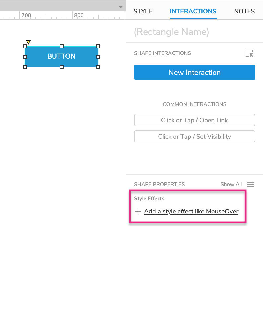
Select the button widget and click Add a style effect in the Interactions pane.
Select MouseOver Style in the list.
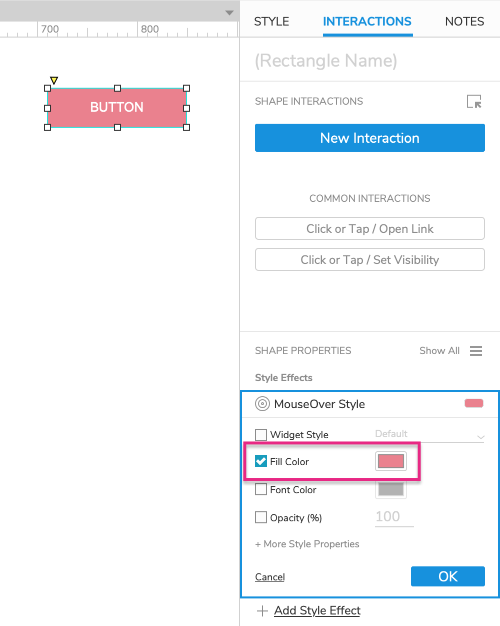
In the MouseOver Style block that appears, check the Fill Color property and select a pink color in the color picker.
Click OK to save the style effect.
3. The MouseDown Style Effect
The MouseDown style effect temporarily changes a widget's styling when the widget is clicked, while the mouse button is pressed down. When the mouse button is released, the widget returns to its default styling.
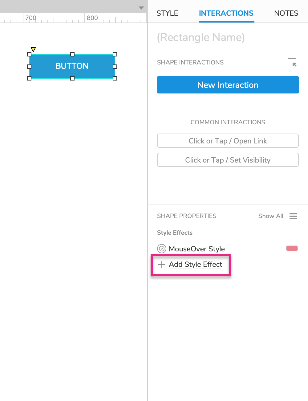
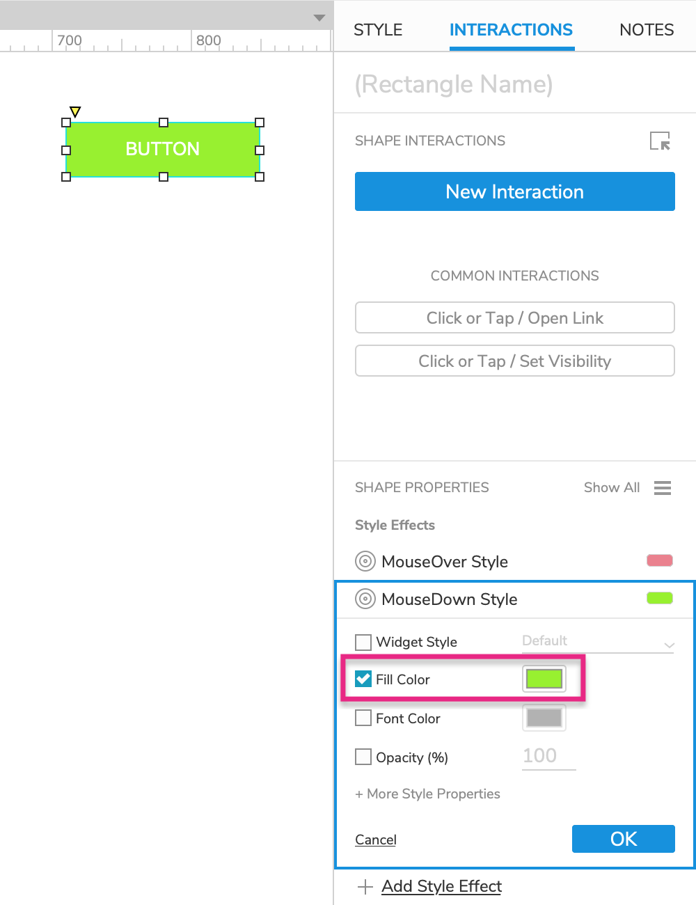
With the button still selected, click Add Style Effect in the Interactions pane.
Select MouseDown Style in the list.
In the MouseDown Style block that appears, check the Fill Color property and select a green color in the color picker.
Click OK to save the style effect.
4. Preview the Interactions
Preview the page and mouse over the button to make it pink.
Hold your mouse down on the button to make it green.
5. The Selected Style Effect
The Selected style effect temporarily changes a widget's styling when the widget is set to its selected state with a Set Selected action. (For checkboxes and radio buttons, this happens automatically when they are clicked.) When the widget returns to its unselected state, it also returns to its default styling.
Note
For some examples of the Selected style effect in action, check out the Tab Menu tutorial and the Navigation Menu tutorial.
Add the Selected Style Effect to the Button
Back in Axure RP, select the button widget and click Add Style Effect in the Interactions pane.
Select Selected Style in the list.
In the Selected Style block that appears, check the Fill Color property and select a purple color in the color picker.
Click OK to save the action.
Set the Button to Its Selected State
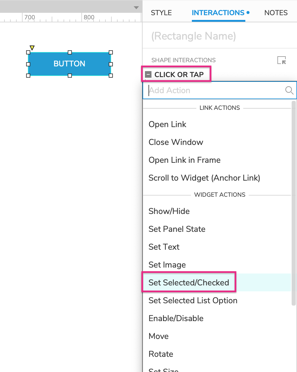
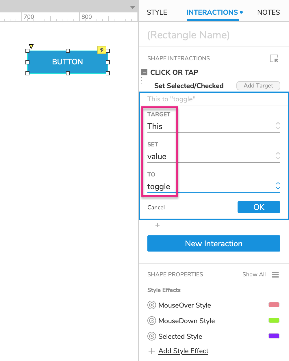
With the button still selected, click New Interaction in the Interactions pane.
Select the Click or Tap event and then the Set Selected/Checked action.
Select This Widget in the Target dropdown.
Leave value in the Set dropdown and select toggle in the To dropdown.
Click OK to save the action.
6. The Disabled Style Effect
The Disabled style effect temporarily changes a widget's styling when the widget is set to its disabled state with an Enable/Disable action. When the widget is enabled again, it also returns to its default styling.
Note
While a widget is disabled, users can't click it or type in it in the web browser. This is particularly applicable to form widgets, which you may want to disable in certain cases. For an example, check out the Terms and Conditions tutorial.
Add the Disabled Style Effect to the Button
Back in Axure RP, select the button widget and click Add Style Effect in the Interactions pane.
Select Disabled Style in the list.
In the Disabled Style block that appears, check the Fill Color property and select a grey color in the color picker.
Click OK to save the action.
Set the Button to Its Disabled State
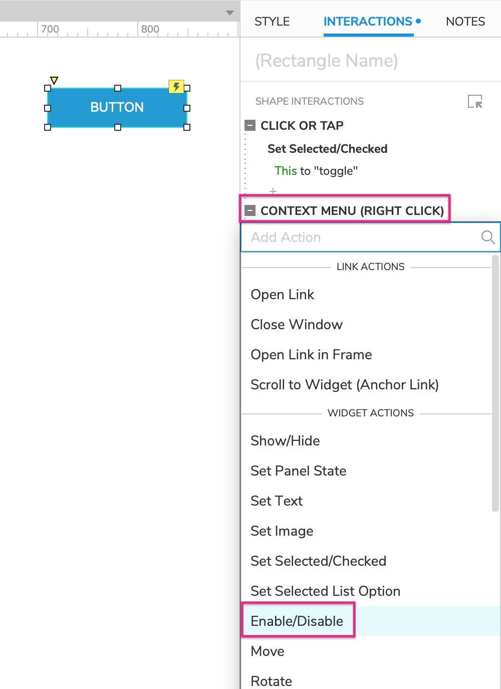
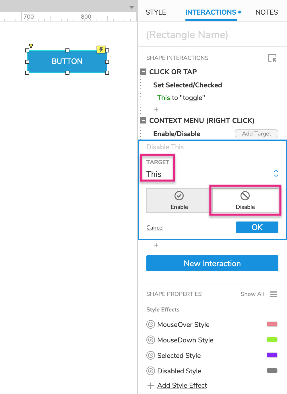
With the button still selected, click New Interaction in the Interactions pane.
Select the Context Menu (Right Click) event and then the Enable/Disable action.
Select This Widget in the Target dropdown and select Disable below it.
Click OK to save the action.
7. Preview the Interactions
Preview the page and click the button to set it to its selected state and make it purple. Then click it again to remove the selected state.
Right-click the button to disable it and make it grey.
